
Using a kit for a specific project, containing unfamiliar yarn in colors of someone else’s choice, is a kind of tourism into the interior of someone else’s brain. I like the scenery in the interior of my own brain, but sometimes it’s nice to get away. Adinda Zoutman is a crochet designer in the Netherlands and the owner of Adinda’s World, who makes big, over-the-top, exuberant shawls in bright colors and heavy applications of flowers, dots, and stripes that play with kitsch and make it work. Visiting the interior of Adinda’s brain is the crochet equivalent of Dorothy’s Kansas house landing in Munchkinland. The two months I spent in Adinda’s World making the Folklore shawl from her kit gave me insights into another designer’s thought process that I wouldn’t have gotten without using the kit to try to replicate her design as closely as I could.
The kit arrived in a huge, beautifully decorated box containing an overabundance of yarn and a printed instruction booklet. At first the instructions worried me. Adinda’s English is a whole lot better than my nonexistent Dutch, but the English was imperfect, and my limited experience with crochet patterns wasn’t sufficient for me to fill the gap between Adinda’s unexpected wording and her intended meaning. There were some charts and photos, which helped a little, but very large portions of the shawl were not charted because Adinda assumed that the crocheter would know what to do after being nudged in the right direction. As for the photos, I’ve been spoiled by patterns published on electronic files that make it possible to enlarge the details, and that can’t be done with a pattern printed on paper. However, I have a brain, so I dusted it off and used it. When I got to unclear parts of the instructions, I used context to approximate what I could make out from the pictures, and if it wasn’t perfect, I didn’t fret about it. Eventually everything became clear when I had yarn and hook in hand, and I discovered halfway into the project that my proficiency in crochet had jumped a level.
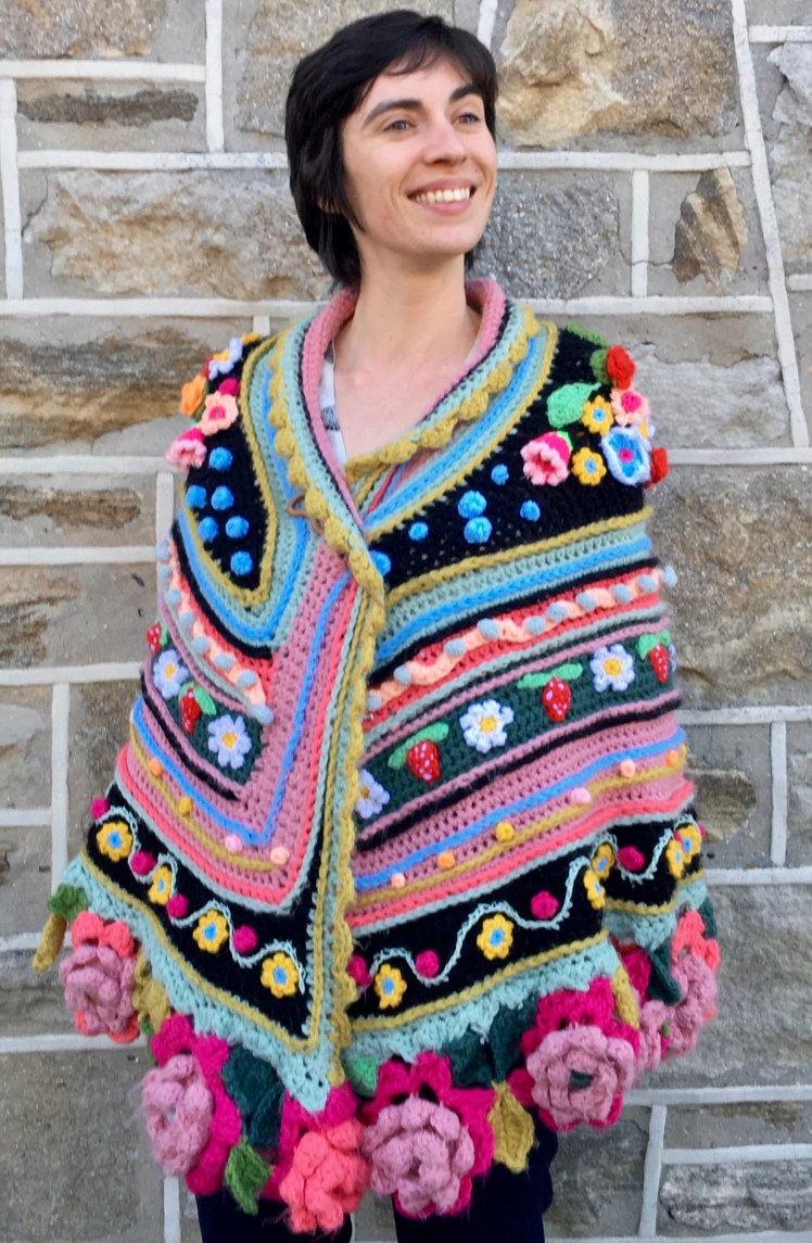
The shawl is built on a base of single crochet mesh whose center is an isosceles trapezoid. After that, there is a series of borders, some going around the entire center piece and some placed only on the curved bottom edge. The colors of that foundational mesh are black and two greens and two pinks, in shades that stirred a sensory memory of the linoleum in my grandmother’s kitchen when I was in low single digits.

One of the greens, the pale blue-tinged grayish one, was the exact shade of the paint on the cinderblock walls in my high school. If I didn’t know that context is everything in color usage, I might have hated that color because of its emotional association with a time and place after which everything that happened was an improvement, including the year after college when I got fired from my crummy job, got sick and landed in the hospital without health insurance, got another crummy job, and then my house burned down and I got fired from that other crummy job. (Yeah, that annus horribilius was an improvement over adolescence.) The colors were sparking an interesting emotional response in me, but Adinda was going somewhere with this.
So the color foundation of the shawl was a dusty pale bluish grayish green balanced by a pale dusty pink, and a darker piney bluish green and a salmon pink, offset against black. The colors sit opposite each other on the color wheel and are counterparts to one another in their degree of chroma, that is, the amount of gray mixed into the hue. By themselves, the color combination had a kitschy, Grandma’s-linoleum look, but Adinda wasn’t done. The next phase was what Adinda called “fixed face borders,” that is, lines of surface crochet applied to the edges and interiors of the stripes of single crochet mesh. This is where Adinda introduced the wider range of pinks and greens and pale blue, and even the very first two lines of pale blue and yellow green in the pale blue-gray-green transformed that color from the traumatizing institutional green of my high school’s walls to a shimmering and beautiful gradient. This is the color wisdom I repeat at every opportunity: never reject any color because of the way it looks in isolation, because gradients make every color look beautiful. Never reject any broad color category, because context changes its appearance. It just depends on how it’s done, and Adinda is spectacularly good at it.

It wasn’t always clear to me, due to the language gap and my inexperience in crochet, exactly what colors Adinda was placing where, but I went to a lot of trouble to replicate her color relationships. In her introduction to the pattern, she invites the crocheter to deviate at will from her recipe and to do one’s own thing at any point. I didn’t want to do that. I can do my own thing any time I like; if I did that in this project, I would miss the opportunity to experience color relationships in a way that wouldn’t occur to me if I just did what I do. It would be like traveling to a foreign country with a distinctive and characteristic cuisine and insisting on taking all meals at MacDonald’s. What I wanted to see was how Adinda created dissonant or kitschy mini-contexts and then incorporated them into a broader context where the dissonance added information about color relationships and the kitsch added charm and cultural references.
For example, the dark piney green stripe is decorated with red strawberries with white dots and light green leaves, alternated with white daisies with yellow centers. The colors remind me of a kerchief I have, the same green printed with white and yellow edelweiss, given to me by German friends as a souvenir of German culture. The color combination makes me think of apple-cheeked blonde maidens smiling in their dirndls. It’s kitsch and it’s adorable. As for Adinda taking a dissonant color combination and making it work, I direct your attention to the black stripe at the bottom of the shawl, where Adinda combines bright yellow, pale blue, hot pink, and sparkly pale institutional green. To my eye, that’s an unlikely combo. But every color relates to other colors nearby, and it keeps the eye bouncing from here to there, searching for, and finding, coherence. That’s successful design. The sparkly pale green yarn is the exact shade of the green yarn that reminds me of the paint on my high school walls, except now it’s cute, and the color is found in the borders immediately above and below the black stripe. The pink dots refer to the pinks in the big, heavy flowers of the bottom edge of the shawl. The yellow flowers bring the eye up to the nearby white daisies with the yellow centers, and the flowers’ blue centers add a bit more context and variation to the blue surface crochet in the adjacent dusty pink stripe. I love what Adinda did there: she used something that normally isn’t a great idea and turned it into a great idea.


I stuck as closely as I could to Adinda’s model, but I did go off in my own direction at several points. Due to my inexperience in crochet, I had trouble with the semicircular shape Adinda makes for the mesh base. I didn’t understand what she meant by her advice to place the increases for the corners as high in the corners as possible, and I didn’t have a feel for how to make the increases so that the top edge was straight and the bottom edge was round. There’s no substitute for experience here; it isn’t possible to write explicit instructions. The result was that my top edge curved and my bottom edge wasn’t deep enough, so I worked very hard to correct the shape by working areas of half-double crochet into the single crochet of the mesh and adding additional height to concave parts of the top edge in a valiant attempt to make it straight. I did correct the depth of the bottom curve, but I never succeeded at straightening the top edge, and somehow I managed to run out of the pale institutional green prematurely. I had just enough to make the scalloped edging at the bottom, but there wasn’t enough to go all the way around the shawl. I substituted the yellow-green at the top edge, and I think it looks as if it belongs there. The curve at the top edge troubled me until I tried on the half-done shawl and discovered that the curve folded over on itself to make a very pretty collar, which had the added advantage of making the shawl warmer exactly where I hate being cold. Once again, the Fiber Goddess looks out for me even when I mess up.
I also diverged from the pattern in my color choices for the big floppy roses at the bottom edge. It isn’t a very drastic divergence, but instead of using the same two pinks for all of the roses in the way Adinda’s instructions specified, I used all of the pinks in the bulky yarn and mixed up the arrangement a bit because my inclination is always to do a gradient when I have the chance. For the leaves, I used all of the different greens in the kit. Adinda’s instructions got a bit vague when it came to the colors for the leaves, so improvisation was the order of the day by necessity.
Another divergence from the pattern was in the dusty pink stripe between the dark green stripe with the daisies and strawberries and the black stripe with the pink dots and yellow flowers. My stripe had gotten wider than Adinda’s while I was correcting the shape of my bottom curve to make the shawl sufficiently semicircular. Adinda’s version has one line of surface crochet in light blue in that dusty pink border, which leaves a lot of empty space in my version. I added another line of surface crochet in the yellow-green, parallel to the light blue line. These colors are of equal value and chroma as the dusty pink and they make the dusty pink shimmer, but there was still space in that stripe that called out to me for additional embellishment. My first thought was to fill the space with black and white circular pinwheels that would provide a graphical reference to the black backgrounds and the white in some of the flowers, but just as I was searching for the black yarn, my sister was finding it under her couch after we had spent the weekend in Philadelphia with them. I leave stuff behind at my sister’s house with annoying regularity, so I didn’t want to force a trip to the post office on her.
Thwarted from my first idea, my next thought was to use the light, warm colors in some way that would reinforce the orange, yellow, pink, and apricot that were used in some of the flowers, without contrasting distractingly with the colors already in place in that stripe. My daughter warned me, “don’t gild the lily.” This was good advice, because the design was already quite busy and it wouldn’t take much to push it over the line into overload. I think my solution– small dots in a repeated gradient sequence of pink, apricot, orange, and yellow placed between the lines of light blue and yellow-green on a dusty pink background– fills the space and reinforces the warm, light colors in a subtle way that doesn’t fight with the strong design elements that Adinda created. The dots that I added also refer back to the dot shapes of the pompom ribbon worked into the border on the other side of the dark green stripe. The way I filled that space isn’t dramatic, but I think it enhances Adinda’s design elements while avoiding conflict with them.


I haven’t said anything about the centerpiece of the design, the bouquets of flowers and accents of blue dots applied to the black isosceles trapezoid. What is there to say? It’s a bit of a no-brainer that a wide variety of flower shapes in bright colors against a black background is going to be beautiful no matter what. The shawl borrows directly from Frida Kahlo paintings, who was borrowing from folkloric traditions crossing the globe from Russia to Latin America. The only danger this reliably beautiful trope could fall into is overuse and cliché. My analysis of how Adinda avoided cliché goes back to the Grandma’s linoleum colors of the unadorned mesh base of the shawl. The pinks and greens are complementary to each other and equivalent in chroma, value, and saturation. Adinda layered other hues on top of the pinks and greens, and because they also were equivalent in terms of chroma, value, and saturation, there wasn’t a lot of light-dark contrast, which made the different hues completely alter the look of the colors of the base in a cross-color-wheel gradient (a term I just made up). That is to say that different hues will blend into each other in a gradient if they are equivalent in the amount of gray in them and have little light-dark contrast, producing an unusual and thought-provoking color logic. The bright colors in the flowers offered high-chroma references to the low-chroma colors of the base, which keeps the eye and brain busy in the search for contrast and repetition, and satisfied in the finding of them. That kept the tried-and-true folkloric trope fresh and new.


I just love this. Thank you for letting us in on it.
LikeLike
I’m glad you are interested!
LikeLike
I was somewhat shocked to see how large it is. What a tour de force. Thank you for your analysis of why the colors work so well. What a fun project. Those big roses at the bottom are very fun.
LikeLike
Thank you! The project was a delight from start to finish.
LikeLike
This is awesome, beautiful, and I don’t know that I’d wear it, but I love it. I think back in the 70s I would have had no problem strutting about in it, but these days my clothing is quite unassuming. Lovely work there.
LikeLike
Thank you! To be honest, it’s not the most practical and wearable thing I’ve ever made. It’s very cozy in a cold house, but the climate where I live doesn’t offer many opportunities to wear it outside with an appropriate outfit. It was fun to make in any case.
LikeLike
Hi, I purchased this kit a few years ago and just now looking at it. I am overwhelmed just by starting the first part (black) of the shawl. I do not understand the pattern at all. I get to row 5 and then I am lost. Is there any way you can help me? My first and second tries came out way too small. I wish someone would make a video making this shawl from beginning to end. That would be amazing and a big help to me.
LikeLike
I made the shawl several years ago, and I don’t remember the pattern in enough detail to advise you about the specific instructions. Does Adinda have a “contact” link on her website? Could you give up on the instructions and crochet until you like the size? Adinda has a Facebook group that is supposed to offer the kind of support you’re asking for, maybe that would be useful.
LikeLike
Hermos el trabajo me gustaría aprender y quiero saber sí puedes compartir el patrón o sí lo vendes cómo puedo adquirirlo. Gracias
LikeLike
Thank you for the compliment on my work, but it’s not my pattern to share or sell. I bought the kit and the instructions from the Adinda’s World website. The link is in my post.
LikeLike