
Over the past nine months I have been experimenting with the basics of plant dyeing using scavenged materials. The thrill of uncovering beautiful colors hidden inside ordinary plants that I never noticed before, or food waste that I would have thrown away without a thought, could almost have distracted me from the fact that I was accumulating dozens and dozens of 1 or 2 ounce cakes of yarn in subtle gradients of natural colors. Almost, but not quite. I have enough of a SABLE (stash acquisition beyond life expectancy) problem without intentionally dyeing more yarn that won’t get used before I die. I may have done that anyway. The reason for my falling down this rabbit hole was to get the kinds of colors French crochet designer Sophie Digard uses and to use them my own way. I have kept dyeing and dyeing because getting these pretty colors is teaching me about the secret characteristics of the natural world around me and it lets me pretend to be a scientist without having learned science. And I actually do use what I dye.

Thanks to Pinterest’s clever algorithms, I’ve seen a lot of Sophie Digard designs, and have been able to generalize what I love about her work. Her soft and subtle colors, of course, but also the way she uses shape and line to make the eye linger on the variations between similar colors and notice their differences and relationships to one another. And then, before the eye gets too comfortable with the soft colors, she jerks it back to attention by throwing in something contrastive, even transgressive, in exactly the perfect place to tell the eye something it didn’t know about the colors and shapes. Another important thing, I love the way she uses irregularity as a design feature. Also, at least according to the scale of the photos I was looking at, she avoids the holey-ness that disturbs me about a lot of crochet because it strikes my knitter’s sensibility as loose and sloppy. But I stopped looking at Sophie Digard designs in January during my 2017 January Swatch-a-thon, because I was starting to put these principles into action for my own interpretation, and I didn’t want her inspiration to turn into a controlling influence that would inhibit my own design decisions.
I started to forget that Sophie’s general style is to adhere to one stitch pattern for thematic unity and to inject eye movement by grouping together colors of similar value and then forming borders between the groups with contrast colors or by forming islands of colors of contrasting value, and decided I would play with a variety of different crochet motifs. For the Swatch-a-thon, I crocheted a swatch of Frankie Brown’s Big Dots, Little Dots pattern to see how my natural hues interacted with acid-dyed colors from Wollmeise. That swatch became the foundation of my patchwork top using the plant-dyed yarn I’ve been accumulating over the past months.

I also riffed on pinwheel spirals, concentric “C” shapes, zigzags, stripes of different widths, lengths, and shapes, and gradients. Why? Because I like them.


But I needed a device to give these disparate shapes coherence within the composition.
The design principles that I consciously follow when I’m creating a design were articulated by Erica Heftmann, the dyer and creator of the now-shuttered Etsy shop Colorshiftyarn, in her brilliant treatise “Color in Black and White” on how to use color effectively in fabric design. Unfortunately neither Erica’s yarn nor her writings have been available for the last couple of years, and there is no information about when or whether they ever will be available again, although I fervently hope they will. This is the part in the treatise that I keep coming back to:
The goal of design is to detain the eye. The eye comes into a design and is not willing to leave it. It is detained. Even if the design is not of our taste, it can still be evaluated and appreciated on this level. Is the eye staying within the design or does it want to leave it?
Okay, let’s say the eye is detained. Why? What is it doing in a good design that makes it in no hurry to leave? What is it doing in a great design that makes it unwilling to tear itself away?
The eye is comparing the elements it sees. This is what the eye does to see and discern. It is its business. The eye is searching for order. To do this, it is comparing anything that could be the same but is different: big and small, dark and light, near and far, warm and cool, bottom and top.
Comparisons are contrasts.
Suppose we’ve painted a checkerboard. The eye finds this fun at first. Oh!, it exclaims. Black then white! And black this way, white that way! Many blacks and many whites! But at some point, the eye is satiated. The roaming becomes pacing. It gets restless in this monotony and seeks something new and interesting. Are these blacks and whites going to resolve somehow or somewhere? It begins to look to the edges and if it finds nothing, it continues right out of the design.
Since the paint is still wet, we get a stick and drag it across the checkerboard creating streaks and spots, swirls and angles. The eye returns but gets irritated with the chaos after making a quick survey. It wants something with more structure. It looks away to find something more comfortable. If there is a border, it may look to that and then back inside again, but likely will leave the design entirely.
Now we know that the eye is not just comparing but seeking a balance between unity and variety. Within that balance, it is happy to to-and-fro, to go from something the same to something a bit different and back again.
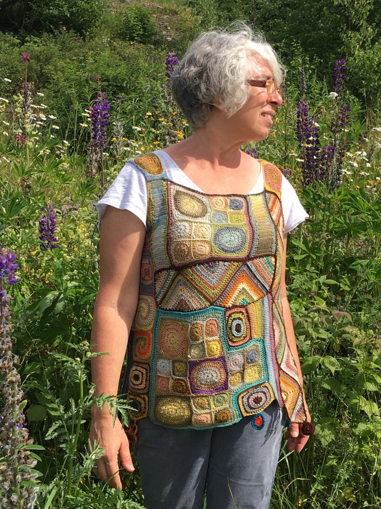
So I had this variety of shapes in subtle colors with not a lot of value contrast, and I needed to find ways to detain the eye so that it could discover contrast without ricocheting from one unrelated thing to another unrelated thing until it just bounced away, or got lulled into monotony by the quietness of the natural colors. The trick was to find a balance between order and the disruption of order in the way the various motifs were arranged. The eye likes order; the eye gets bored and wants a change; change starts feeling hectic and the eye seeks out order again. I needed to avoid scattering the motifs in an illogical and incoherent fashion with little in the way of color contrast to focus the eye. This was where I stopped thinking about Sophie Digard and started thinking about Gustav Klimt. My solution was to group each motif together in irregular angular formations delineated by strong lines of contrasting color, a device that Gustav Klimt used frequently in his compositions. Again, I avoided looking at source material while I was composing my own arrangement. If I look at my sources of inspiration while I’m in the process of creating an original work, it shuts down my problem-solving abilities.
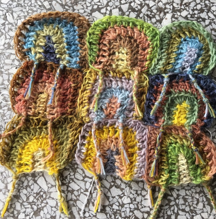
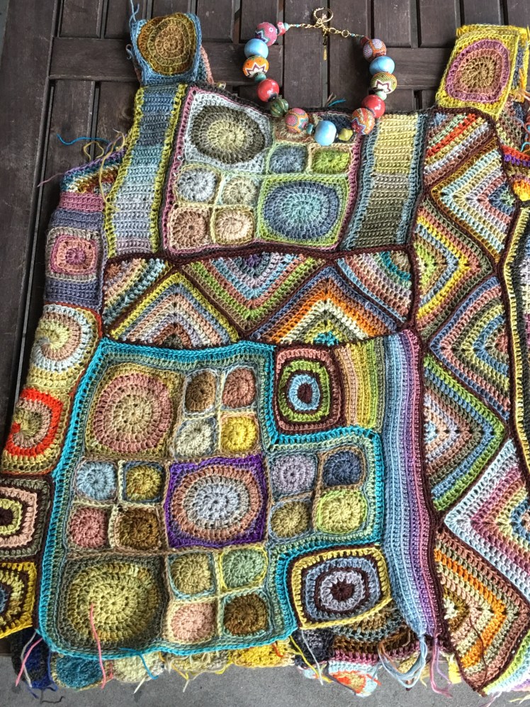
Since many of the colors I have dyed are of similar value and their arrangement in the motifs hasn’t been specifically systematic, the groupings needed a strongly contrastive border to corral the eye inside the motif units where it could search for the same-but-different relationships Erica discusses as the means for detaining the eye within the design. That is to say, the dark colors of the borders guide the eye around the irregular shapes of the groupings and then direct it inside where it can study the interaction of the colors in the pinwheel spirals, in the configurations of the circles-in-squares, and in the concentric “C” motifs. I used colors dyed by Wollmeise to provide value contrast, and sometimes shock value, that wasn’t available in the range of colors I have dyed using plants.

Let me give a walking tour of what I’m talking about.
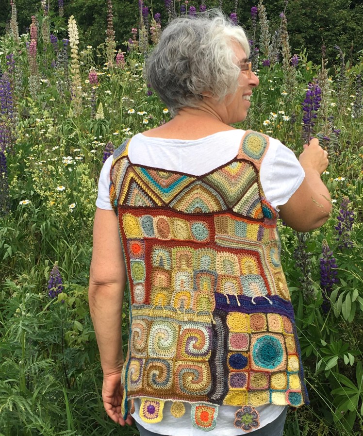
Here, for example, the rust border summons the eye to the circles-in-squares that are arranged at a right angle to each other. First it looks at that spot of neon orange burning out of its natural pink-brown background and tries to figure out if it loves it or hates it. But there’s another spot of neon orange down at the hem that the eye travels down to see, and the eye goes up and down diagonally across the fabric discovering the similarities and differences between those two spots of orange. Maybe it loves the orange, now that it sees it’s not alone and not a complete out-of-context interloper, or maybe it doesn’t. It doesn’t matter as long as the eye is looking and thinking. After a while, the eye then settles on what’s going on in fly0ver country.
It notices the blue circles-in-squares in the rust-bordered right angle configuration and looks for other recurrences of blue within that unit and outside it, especially that large dot of vivid turquoise gradient in the circles-in-squares unit, bordered by that thicker strip of dark blue at the opposite corner. The eye does some more shuttling over the geography of the piece in search of comparisons with that focal point, and travels up to the aqua V of the zigzag strip at the top of the garment. Having taken care of the urgent business of figuring out the role of the bright bits in the overall context, the eye is then ready to give some thought to the quieter and more subtle relationships of the natural colors in the concentric “C” unit and down to the horizontal strip of natural colors that separates the C’s from the spiral pinwheels. The eye goes around and around with the pinwheels for a while, then shifts downward and gives some thought to the dangly things attached to the hem. This might not be the order in which every individual processes the composition, but it’s an example of how the eye works to understand a complex design.
As for the strips of zigzag motifs, I considered them to have so much movement and visual impact that I used them as a device to delineate the other motif units, especially since I used a very dark red-brown avocado skin-dyed yarn to attach the component parts together and to attach the zigzag strips to the adjoining units. This ensured a pattern of eye movement that I found very pleasing, because when the piece was attached vertically, the eyed didn’t travel straight down but rather took a controlled downward path alternating right and left. For the horizontally attached pieces, the eye travels upward and downward in a sideways direction, in a similar controlled movement. It’s excitement without chaos.


I love the way that dark maroon brown draws the eye, especially in the concentric squares in the four pictures above. In fact, to me the dark centers of the concentric squares actually look a bit like eyes. I’ve decided the placement of these eyes on the lower parts of my body is interesting-creepy, not creepy-creepy.
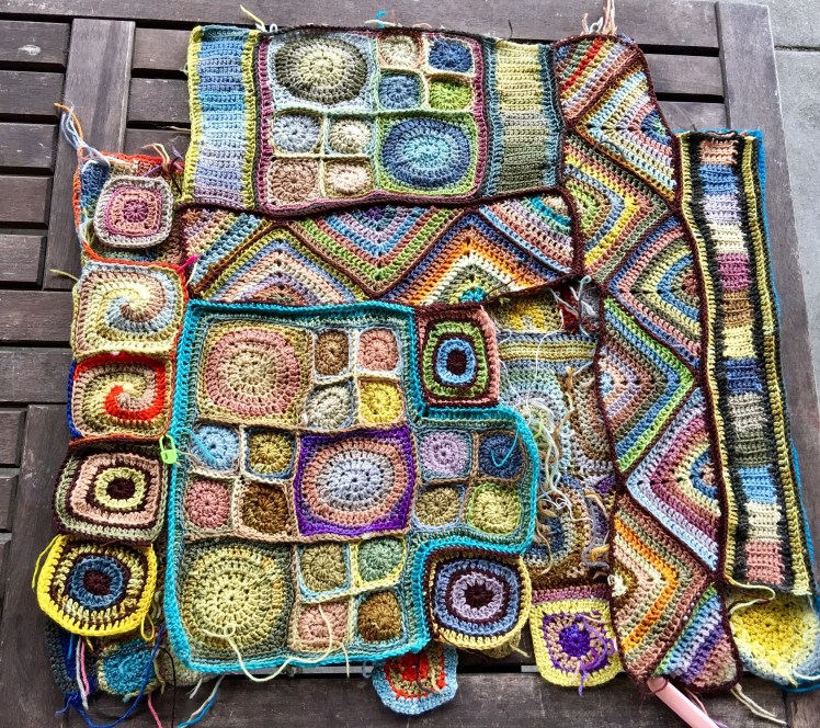
Working out the topography of this garment was an exercise in problem-solving at its funnest. I figured the measurements I needed to get the fit I wanted by measuring the length and width of garments I wear a lot, at the shoulder across the shoulder blades and the collarbone, at the front and back of the armpit, at the bust, at the hip, from the base of the neck to the armpit, and from armpit to the hem. That last measurement was a minimum and maximum range, since I embraced the uneven lengths at the hem as a design feature that I emphasized with dangly motifs sewn onto the bottom edge. After I crocheted a set of individual motifs, I soaked them in water and laid them out to dry flat so that I could get blocked measurements for them individually and as a motif unit that would fit with motif units I had already attached together in my patchwork fabric. A tape measure or ruler was always at hand. Here is a sequence of progress photos that illustrate how I built this fabric and turned it into a garment.


Measuring the top section of the two sides to make sure they’re the same width


The final bit of work was shaping the armholes. I made striped triangles and put them into the square armholes, then curved the angles with single crochet and half-double/half-treble crochet stitches until the fabric covered the bits of me I wanted covered.

I’ve been thinking about this term “fiber arts” that I use to describe the subject of this blog. The “fiber” part of the term enables me to talk about knitting, crochet, machine knitting, dyeing, and any other medium that uses fiber, without going off-topic, and the “arts” part of the term enables me to stay on-topic when I talk about design and the way the eye and brain process visual phenomena. It’s also a problematic term that gets me blank stares when people ask me what I’ve been doing since I retired because knitting and crochet are too… what?… practical? feminine? to be considered “art” as the term is commonly understood, and applying the term “art” to such skills as knitting and crochet seems pretensions, especially when the product is garments rather than something whose sole purpose is to be decorative while delivering a message.
I don’t have the wall or surface space in my house to display works of “art” that I might create, and the idea of making something that doesn’t have a practical function shuts down my imagination. However, the things I make are always built around questions whose answers, in the form of something wearable, provide me with some non-verbal and maybe ineffable information about how my eye and brain process the physical and psychological world around me. For me, that’s what art does, not to mention that at the end of the process, I have something to wear when I get dressed in the morning.
Then there’s the term “wearable art”, which attempts to square this circle. Someone used the term as a compliment when she saw me wearing this crocheted patchwork top, and I thanked her for her kind reaction. But inwardly I cringed because it called to mind those wall hangings with sleeves that I used to see craft show fashion victims wearing at the American Crafts Council annual show in Baltimore, back when I made a practice of attending years ago. I feel strongly that the geometry of the human body is as much a design factor as the interplay of color and shape is in the visual art media, and treating it as an afterthought is an artistic failure. Creating a fabric around the geometry of the human body is hard. I never get it completely right. But the effort is an illuminating source of information about the part of the world that’s always with me no matter where I go: my body.
I’ve been trying to figure out how to say this for years.

Thanks so much for bringing us into the process! I loved all the day by day photos of building the top. Most of all, it’s the sort of top that, if I saw it on display at a fair I’d admire the work and design but wouldn’t be able to imagine anyone actually wearing it. Seeing it on you, I totally love how it is both art and garment!
LikeLike
Thanks, Laura!
LikeLike
Wow ! This is absolutely beautiful ! I love it ! Really, a magnificent example of body art indeed !
LikeLike
Thank you, Marylene! The praise means a lot coming from you. The nice thing about this kind of body art is that the needles went into my yarn and not into my skin!
LikeLiked by 1 person
Oh Abby! That first photo is so full of joy. And the one of all the natural-dyed yarn is like the most ravishing family portrait. Thanks for another thoughtful and honest meditation on art, fiber art, and design.
LikeLike
Thanks so much, Kim! That photo is emblematic of how I felt while we were in Norway.
LikeLike
Wow, wonderful work! You must be a very busy person 🙂
LikeLike
Yes, I do keep busy!
LikeLike