
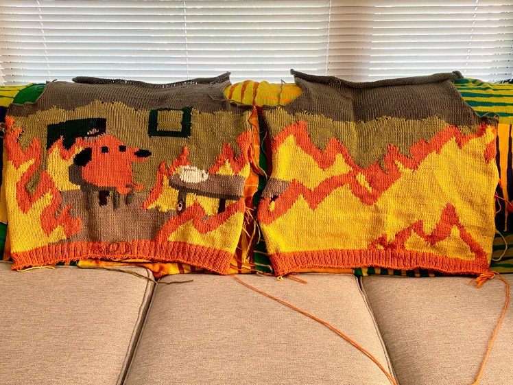
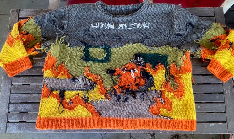
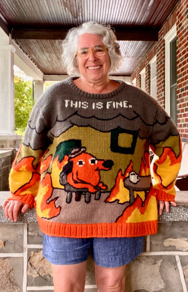
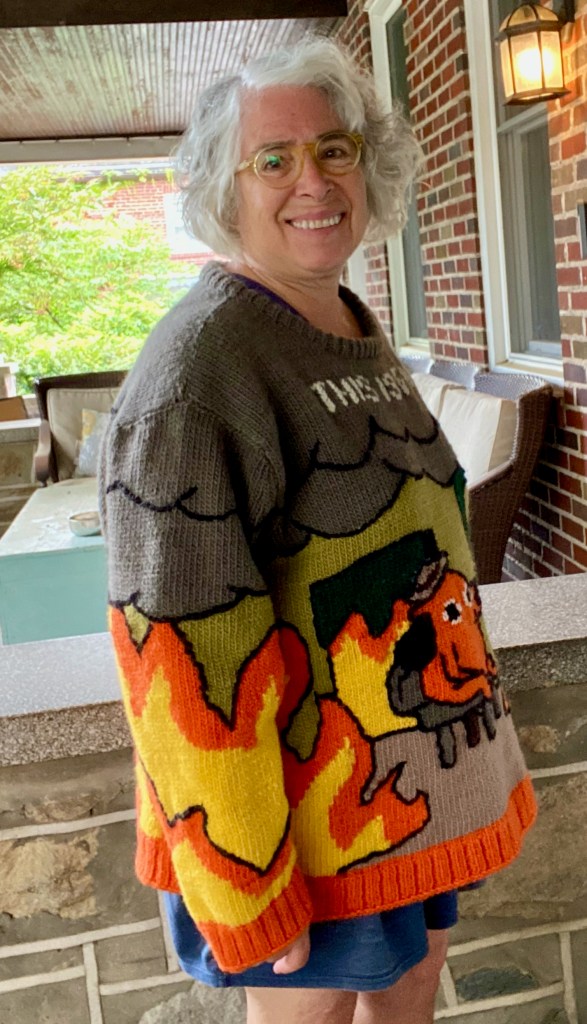
Part Two of my “soft protest” knitting took much longer to make than Part One, even though Part Two was a machine knitted garment, and isn’t machine knitting supposed to be quicker than hand knitting? My second garment protesting the new authoritarian takeover of American democracy is less explicit than decorating a sweater with words banned by the regime because of the punishable sin of demanding that 70% of the U.S. population have the same rights of the 30% who are white men. This new sweater is a replication of a famous meme by KC Green from 2013, depicting a cartoon dog sitting and drinking coffee in the middle of a room engulfed in flames, saying “this is fine.” People see in the messaging what they want to see, and the Republicans even managed to misuse it in 2016 to make fun of the Democratic National Convention at which Hillary Clinton was nominated, which provoked a rebuke from the artist himself. My meaning is exactly what KC Green had in mind: Wake up, idiots! This is not a drill! And it’s coming for you too!
I don’t claim credit for designing this sweater. Not only am not capable of this much charting, but I wasn’t even aware of the meme until I found this pattern that faithfully represented the meme. A young lady in Australia named Kit, designing under the name Yu Jie 玉杰, poured her considerable talent into precisely rendering the meme in chart form, along with pages and pages of technical tips and photo tutorials in an excruciating labor of love. It’s a free pattern on Ravelry, and there are about 60 finished projects on the project page, all of which came out beautifully. That’s a sure-fire way to tell it’s a great pattern. Kit didn’t offer a size range, since just creating the charts was already a huge gift to knitters, but she gave measurements for garments knitted in different weights of yarn at larger and smaller gauges. I will always go for larger rather smaller, so I asked Melissa to order yarn for me that would get me a gauge of 4 stitches to the inch. We decided on Brown Sheep Company’s single ply Lamb’s Pride yarn, which comes in many colors. We pored over Melissa’s yarn cards and matched the colors as closely as possible to the colors of the meme.
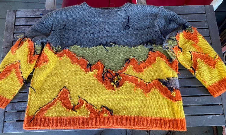
Lamb’s Pride is not easily digestible to the LK150, so I set the tension as loose as it would go, T9, and I did get the gauge I wanted. Melissa used her charting software to flip the charts around so that my machine-knit intarsia, which shows the wrong side while it’s on the machine, would face the right way as a worn garment. I still wasn’t sure I would get the oversized sweatshirt fit that I wanted, so I added three extra stitches to the sides of the front chart and the back chart, and improvised. Those extra stitches made it a bit more complicated to follow the chart, and my flames aren’t the exact shape as the pattern’s flames. But they’re pretty close, and they certainly get the idea across.
When I knitted my version, I only referred to the chart and ignored Kit’s pages and pages of technical advice. One nugget I really should have noted and applied was her advice on how to calculate the amount of yarn needed for the areas of intarsia. Her advice was fiddly and required taking measurements and doing arithmetic, but if I had done it, I would have largely avoided the shag rug of ends that took me about a month to work in and which wasted a lot of yarn, and I probably wouldn’t have had to lose at yarn chicken and order more yarn and wait for weeks to get the right colors so I could finish up the knitting.
While I was knitting, I had regrets about the colors I had chosen because I was worried that the dark green and the dark brown wouldn’t contrast well enough with the black bits right next to them, to allow the patterning to read. I thought about duplicate-stitching a lighter green around the dark green areas and expanding the dog’s jaunty little hat so that it would be more visible and understandable than the weird little shape I had produced by misreading the chart by a few stitches. When I got to the embroidery phase, I did add a few light brown duplicate stitches to the hat shape, which was a good choice. During the knitting, I replaced the dark brown with the gray to represent the shape of the table’s side and legs because I was panicking about the dark brown not showing up next to the black. What I did was fine and didn’t spoil the design, but now that it’s done, I wish I had kept the faith and used the dark brown according to the recipe. Sometimes the pattern is better than what I think are improvements. Sometimes.
I’m glad that I started knitting this pattern by doing the back first. There’s less detail and fewer color changes on the back, and it’s the back and not as noticeable as the front. There was a learning curve in getting used to the way my yarn fit the machine and the intarsia carriage, and in adjusting my reading of the pattern to accommodate the extra stitches I had added to the sides of the pattern. I tried to be as accurate and precise as possible in my rendering of the flames patterning, but I got more accurate and precise with each piece I made. After I finished the back, I embarked on the front. It was very important to the messaging of the work to pay very close attention to the spacial relationship the dog, the focal point of the piece, had with everything else, so I was able to get the number and placement of the stitches pretty close to the chart. There were a couple of things that went off course, but I knew I’d be able to fix them when I got to the embroidery stage of the work. I got more accurate with the charts with each successive piece. By the time I got to the final sleeve, I was following the chart precisely.
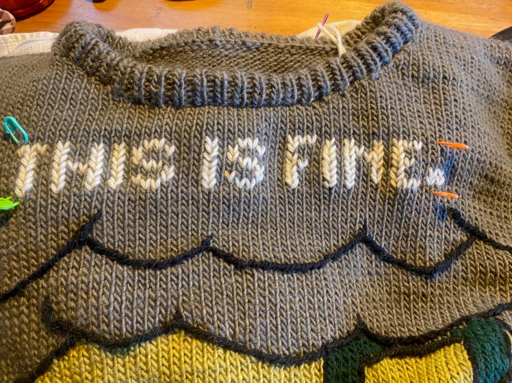
I puzzled for a long time about doing “THIS IS FINE” in duplicate stitch in the smoke clouds: yes or no? I created a poll on my Ravelry group and got an even split. It’s a famous meme and almost everyone knows the catch phrase, so spelling it out is redundant, said the no side. But the yes side included my younger daughter, who was unfamiliar with the meme despite being part of the targeted demographic, and Melissa’s husband Dave, who is an artist and very aware of pop culture, but still thought that visually and from the messaging perspective, using KC Green’s punch line would deliver even greater impact than assuming everyone was in on the joke. I made a conscious decision to use the period at the end of the lettering, aside from the fact that KC Green also used the period, because the period implies a finality and certainty to the absurdity of a statement that is flagrantly (literally, according to the word’s etymology) contrary to fact. Melissa originally was on the no side, but she came around to yes when I showed her images of how KC Green used his punch line. My own feeling is that this is no time to be cool and subtle and treat people who don’t know the meme as too uncool to get the point.
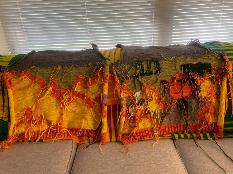
My knitting was far from perfect by the time I assembled the knitted pieces. There were holes between the color changes, especially at the smoke clouds. There were split stitches, and stitches where I lost at yarn chicken and were disintegrating because my ends were too short. The wrong side was a dispiriting shag rug of ends whose mess boggled my mind so much that I had trouble even knowing where to begin to work them in. I had stranded the table legs, which tightened the knitting so that those columns of stitches bulged visibly. When I finally got serious about weaving in my ends, I had so many that I had no choice but to stuff them all into the spaces where the two colors wind around each other to close the holes between color areas. There were many, many bulges. That is not good form.
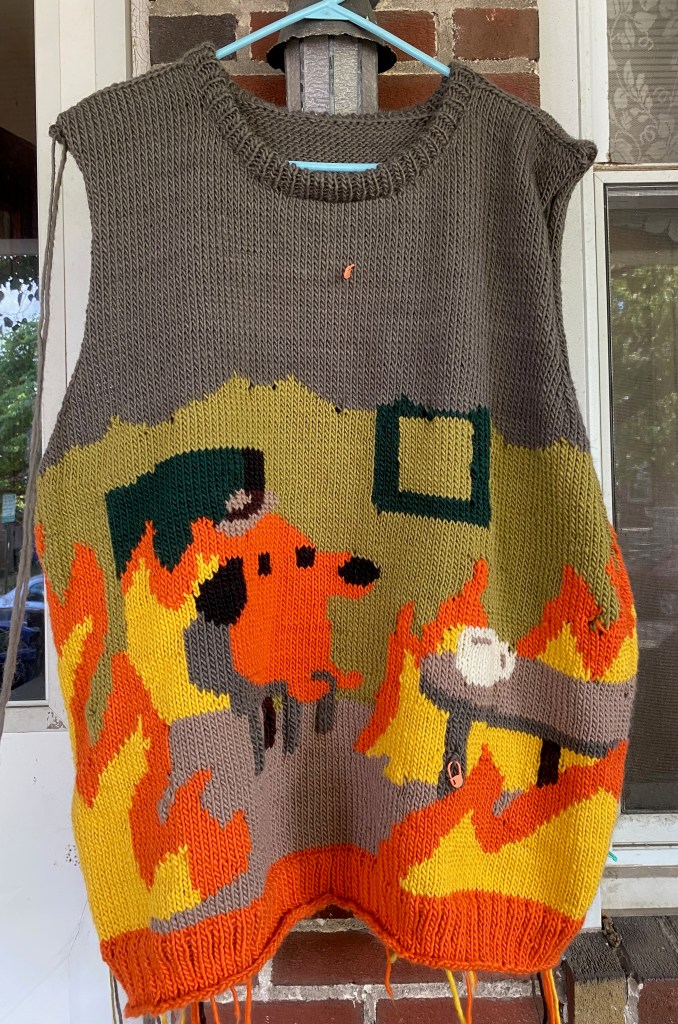
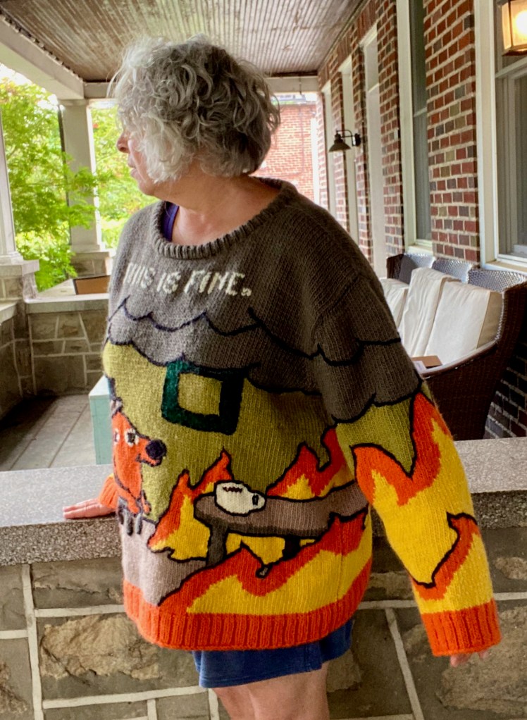
But then a miracle happened. I started doing the backstitch embroidery in black worsted weight yarn, and suddenly the meme emerged with clarity and impact. The dog’s silly little hat, which looked like absolutely nothing other than a dog’s breakfast after the knitting, now looked intentionally like the silly little hat in the meme. There was a learning curve in getting the embroidery stitches in the right place to delineate the shapes the way I wanted them, and I pulled out a lot of stitches a lot of times before I was satisfied. I especially poured my efforts into the dog, since it was the focal point of the design. As I discovered when I was making my faces wall hangings (DNA and Faces Come Out of the Rain), a variation of millimeter or a fraction of a millimeter can completely alter one’s perception of a face or a facial expression, because humans are hard-wired to read facial variations with extreme precision. So I worked very hard on the size and placement of the three or four little stitches for the dog’s stupid, clueless, complacent smile. The dog’s body and the chair he was sitting on were undefined blobs before the backstitching, so those lines of stitching needed to be done very carefully in order for the dog shape and the chair shape to make sense.
Another wonderful thing the black backstitching did was to add textural definition to the dark green, dark brown, and even the black areas, so that the dark green frame, the legs of the table, and the dog’s black nose and ear looked like clean and clear design elements that served the messaging. The backstitching also managed to even out the appearance of the lumps along the color changes, where I had crammed way too many ends into the spaces where the yarns wound around each other to avoid holes. The overstuffing even turned into a textural feature. The bulges at the chair legs were still visible, but they give the piece a three dimensional quality that I like a lot. And the backstitching around the flames was probably the most fun thing to do in the entire project.


I had cleaned up my ends pretty thoroughly, not 100% but maybe 85%, before I started the embroidery. The embroidery added a whole new crop of ends, but by then, more ends-weaving just seemed like a mental illness treatable with prescription drugs. The embroidery yarn wasn’t going to unravel, so there was no functional purpose to finding spaces that no longer existed for stuffing in those ends, so I knotted them together and snipped the especially long ones. I’m fine with showing the inside of my work. Think less of my workmanship if you’re inclined to; find permission and validation in my example if you question the added value of eradicating every damn end.
Wrong side of finished front and back, at the border between fastidiousness and slovenliness:
Finally I was done with everything that required a needle of any kind. There was a bit of lumpiness in the seaming that might be addressed by a good washing, so I put the sweater into a bath with a few squirts of hair conditioner, for a long soak. It grew to the size of a circus tent when I laid it out flat on the floor to dry. Before it was completely dry, I tried it on, and the hem came down to my knees, and the cuffs were pretty close to my knees too. Those three stitches I added to the edges of the front and back were probably unnecessary. Then I threw it into the dryer for 8 minutes, tried it on again, threw it back in for 4 minutes, tried it on, and back in for another 7 minutes. It was just a little damp then, but it felt thick and soft and fluffy, a little bit felted, and capacious but not ridiculous. Later in the day it was fully dry, and it was perfect. I long to wear it, but it’s July in Baltimore and 90º Fahrenheit with humidity that feels like breathing through a plastic bag.
It’s still too hot to wear my first Soft Protest sweater, the one made up of banned words, to see how it plays out in the wild, so I don’t know what kind of reaction I’ll get to it. I think this second Soft Protest sweater will be less controversial, because it’s both more vague and more familiar, whereas the banned words sweater is a direct poke in the eye to racists and misogynists, who can be violent and dangerous when provoked. The meme for this sweater offers great scope for misinterpretation, so it’s possible I would get approving comments and knowing chuckles from the very arsonists I want to warn against. That would be a bit frustrating, although not getting verbally and physically abused is a good thing. But at least I would be warm and cozy while being misunderstood.
Modeled photos taken in the five minutes I could find when I might not pass out from being outside in a huge felted wool sweater. Not me at my most photogenic.


WOW! Just WOW!
LikeLiked by 1 person
Thanks, Kay!
LikeLike
Fabulous rendition and so very needed. You made me think of doing a dumpster and using the flames.
LikeLiked by 1 person
Thank you! There were a whole lot of dumpster fire patterns on Ravelry from the first time we went through this nightmare. Shouldn’t one time have been enough???
LikeLike
I am new to the MKC and came here for the promised “angry social commentary garments”. This first one does not disappoint. Bravo!
If there are any notes, a pattern, or a how-to, I would love to see them.
LikeLiked by 1 person
Yes, there’s a hand knitting pattern on Ravelry. It’s excellent and it’s free. But it’s not written for machine knitting. My blog post describes how I made it work for intarsia on the LK150.
LikeLike
LOVE IT! 😍
LikeLiked by 1 person
Thank you!
LikeLike