
I suppose it’s not really a news flash that I finished a project intended to use up yarn in my stash, because I have a lot of yarn in my stash and I try to use it, and it’s not news that I finished the project, because I usually do. But I mentioned my in-progress Floribunda crochet project in a recent post, and now it’s finished, and now I have less linen and cotton-linen yarn in my stash. And, by the way, the finished object is pretty.
I followed a published pattern for this project, Floribunda in the Summer 2022 Pom Pom magazine. I followed it quite closely, mostly. I didn’t like the skimpy fit on the pattern’s model, so I sized it up for the oversized fit that liberates me from feeling trapped by my clothing and the sense that my clothes are wearing me instead of me wearing them. Also I used different colors and completely disregarded the pattern’s prescribed color rota. I never really wanted the long sleeves that the pattern gave instructions for, so I planned to abbreviate the sleeves by crocheting the mitered rows around the flower square motifs on only three sides. But I had made the pullover so oversized that I had to make the sleeves shorter, not to get short sleeves but to avoid sleeves that came down to my knees. I ended up with longish sleeves anyway, which I finished with a narrow edging of single crochet that cinched them in a bit.

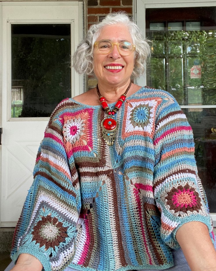

This isn’t going to be a very long post, since the project isn’t my own design and I didn’t make any significant modifications to the pattern, but I have gotten compliments on the colors, so I’ll analyze what I did. Most of the colors are leftovers from a project I did a few years ago in earth, water, and air colors of yarn made of various fibers, linen, cotton-linen, and a peculiar Japanese paper yarn.

This swatch was for a garment that failed because it was too big and I had trouble keeping it on my body, so I gave it to a friend. I bought more of the yarn because I thought I might have another go at the design, downsizing it in attempt #2, but I moved on while the yarn just sat there until I used some of it for the Hipster test knit earlier this year, discussed in the post linked above. After Hipster, I had plenty of the deeper blue, brown, faun, and dark gray, and some of the white, gray-green, and lighter blue left over. Thanks to Melissa’s largesse, I also had several untouched skeins of a light blue linen that was very similar to the lighter blue at the right edge of the swatch, but I could perceive a difference. Melissa also gave me a skein of rose-colored linen that seemed to me to be anomalous in this color environment, and would have been a more natural fit in a pastel Easter egg palette, but making anomalies work is a fun challenge. I have some tricks.
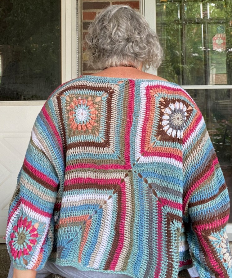
Because I had smaller amounts of the orange, rose, one of the light blues, and the gray-green, and didn’t know how far these quantities would take me before running out, I was going to have to be judicious about how I used them. The Floribunda pattern has you making eight floral granny square motifs that are placed at the top of the garment, two on the front and two on the back, and two on the front and back of each sleeve. I made sure to use each of my less-abundant colors in the granny squares, because then I could position the granny squares so that these colors would appear in all parts of the garment. When I got to the right-angle stripes surrounding or partially surrounding the floral motifs, I used the orange and rose for the shorter rows in order to conserve what I had for as long as I could. When I got down to inches, I used that up too, even if it ran out in the middle of the row, which it did.
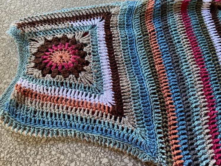

Looking at the pictures of the sleeves and upper body isolated from the full context of the garment, some of those stripes of the rose color are bugging me all over again as an anomaly. When viewed as a whole, the repetition of the color in various contexts brought it into the group as a valued member rather than as an intruder. But I also used my favorite way to integrate outliers into the composition by pairing the rose with the colors that were nearest to it in hue or value. There are several places where I paired it with the orange, because of hue affinity, however tenuous that affinity might have been. It blended with the dark brown and even with the dark gray when the dark gray was in a gradient sequence. I also put the rose into sequences that had white and a lot of blue, which reminded me of nautical flags. When I had used up the white, orange, red, gray-green, and the slightly greener of the two almost-identical light blues, I was left with the darker blue, lighter blue, faun, dark gray, and dark brown. I found a way to make a gradient, arranging them so that their values blended into each other as much as possible, and I kept using this arrangement in various ways, with occasional intentional disruptions to the order. The dark brown was my go-to disrupter because it was a much darker value than the other colors that were still available. I used the brown a lot in the longest rows both because I had a lot of it and because its high contrast was a strong graphic element.


I’m usually not the biggest fan of bright white, because of its tendency to harshen colors, but I like white with blues and neutrals, and I wished I had more of it for this project. I used what I had as an accent, generally with blue and neutrals, but also with the rose, and with the orange when it was with other light colors. When I used it next to the dark brown, it looked harsh until I assembled the pieces and it found its place in a larger context, and then the high contrast moved the eye in a way that I liked. I think that what made these colors cooperate together is my reflexive habit of finding ways to make gradients of disparate colors, and reusing these sequences in different places, punctuating them with what remained of the white and rose. Also, most of these colors were not disparate colors, and the palette was relatively limited. Most were colors that I had selected for their nature-like compatibility, then added a couple more shades of blue and the rose. I also need to credit the designer for the right-angle stripes, which make it very easy to use color and its contrasts in ways that move the eye in its quest for pattern and variation.
