
I stole the idea from the original source of inspiration and then I did everything differently, which according to Picasso and T.S. Eliot makes my theft a laudable thing. Someone on my Ravelry group posted a picture of a cropped, wide, crocheted jacket with zigzag stripes in white and gray and three-quarter length sleeves of colorful granny squares and granny square pockets. I couldn’t get it out of my mind. I have been mired in handknitting projects that have already taken months and are going to take many more months to finish, and the thought of doing something flashy and actually finishing it relatively quickly was not to be resisted.
When someone else’s work inspires me, I look at it closely when I first encounter it, and then I avoid it afterward and try to forget the details of the original source. Even before I decided I was going to have to make my own version, I knew that my version would do the crocheted zigzag stripes in knitting because I am first and foremost a knitter, and if crochet looks like knitting, my knitter’s sensibility decrees that it should be knitting. Zigzag stripes are one of my go-to motifs, and I have done variations of Barbara Walker’s Scrap-Yarn Afghan Stitch over and over again. It’s an increase-decrease stitch that produces points at the top and bottom edges, and I knew immediately that this zigzag edge was a design element that I would have to exploit. I had recently made pompoms for a hat. My appetite for making lots of pompoms was whetted, and how better to use pompoms than to make the points of a zigzag hem pointier?
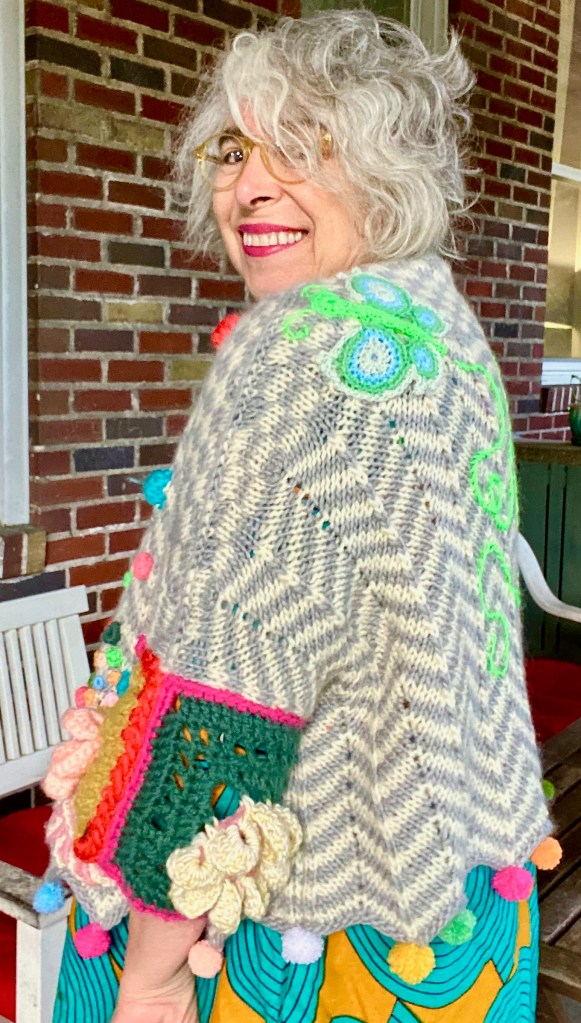
But first I started off cheating on my knitting projects by sneaking off to make crochet motifs. I’m not a huge fan of granny squares, so I went through my copy of Edie Eckman’s Beyond the Square Crochet Motifs until I found a large square motif with a big floppy flower in the middle. I got out a big hook and the yarn left over from my Adinda’s World Folklore shawl kit and started to decode the instructions. The pattern was a good vehicle for lots of bright colors, and in the bulky yarn I used, one motif was the right size for half a sleeve. I made four, and then I swatched the knit pattern and calculated my numbers.
It didn’t take much work or thought to get the numbers. I wanted a circumference of about 56″ to produce dropped shoulders that reached down my upper arms to a couple of inches from the elbow. The pattern repeat was 12 stitches plus 3 for the edges, and my gauge on 6.5 mm needles and chunky roving yarn gave me 63 stitches for the fronts and 123 for the back, which were very easy numbers to use and gave me the circumference I wanted. I was knitting in pieces so that I wouldn’t have to try to guess where to split the knitting in order to fit in the crocheted sleeve motifs. As I knitted my way from hem to neck, I had to work out the logistical and design aspects of putting short-row shoulder shaping into the increase-decrease construction of the chevron pattern. I couldn’t figure it out, so I punted and decided to do something more short-row-friendly that would replicate the gauge of the increase-decrease pattern. That was stranded knitting.
I thought about replicating the shape of the zigzag stripes in stranded knitting, but then I decided that if I was changing techniques, I should make a design element of it. So I decided that another of my favorite motifs, checkerboards, would be a contrast whose graphic simplicity is compatible with the graphic simplicity of a zigzag stripe. I did a 3X3 checkerboard because the numbers are easily divisible into a stitch repeat of 12 plus 3. The short rows were at a 6-stitch interval, using German short rows. I can never remember how to pull up the short-row turn stitch when working on the purl side without looking at a video. I just did it a couple of weeks ago and I have forgotten again. I just looked at the video again, and it’s simple, but I know I won’t retain it next time I need it.
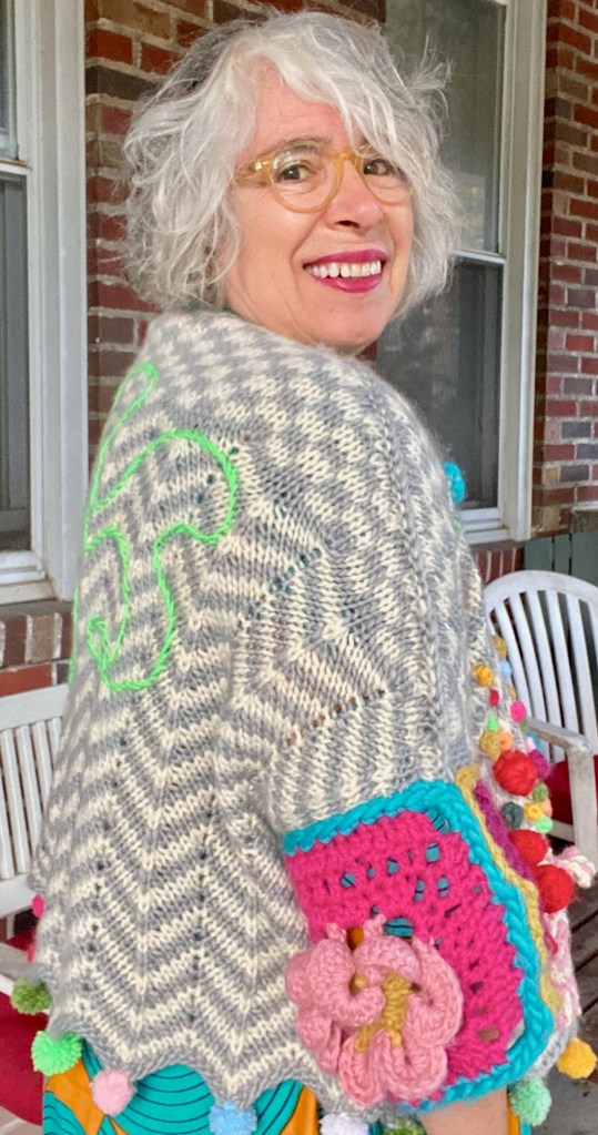
Having made the first of the two fronts, I wanted to make pockets. I went back to my Edie Eckman crochet motifs book looking for one that would be the right size and not too open so that I could put things in the pockets and they wouldn’t fall out. I didn’t see any square motifs that seemed right, but there was a circle shape with concentric circles in two colors in the center and swirly lines radiating from the center. The concentric circles and radiating lines seemed graphically compatible with the other graphic elements of the composition, that is, the zigzag stripes and stranded checkerboard.
The next decision was the colors for the pockets. I would have liked to have done the motif in black and white, but I left the black yarn that came with the shawl kit at my sister’s house and never got it back (because I couldn’t anticipate I would someday want it) and I didn’t have a good substitute. I did have some white yarn with metallic gold painted onto it, and that yarn was the right weight. I thought about pairing it with red for a strong graphic effect, but I didn’t want it to look like a Christmas tree ornament. But I did have plenty of dusty pink, so white with gold sparkles and dusty pink it was. It reminded me of candy from my grandma’s coffee table candy dish, which was the look I was going for.

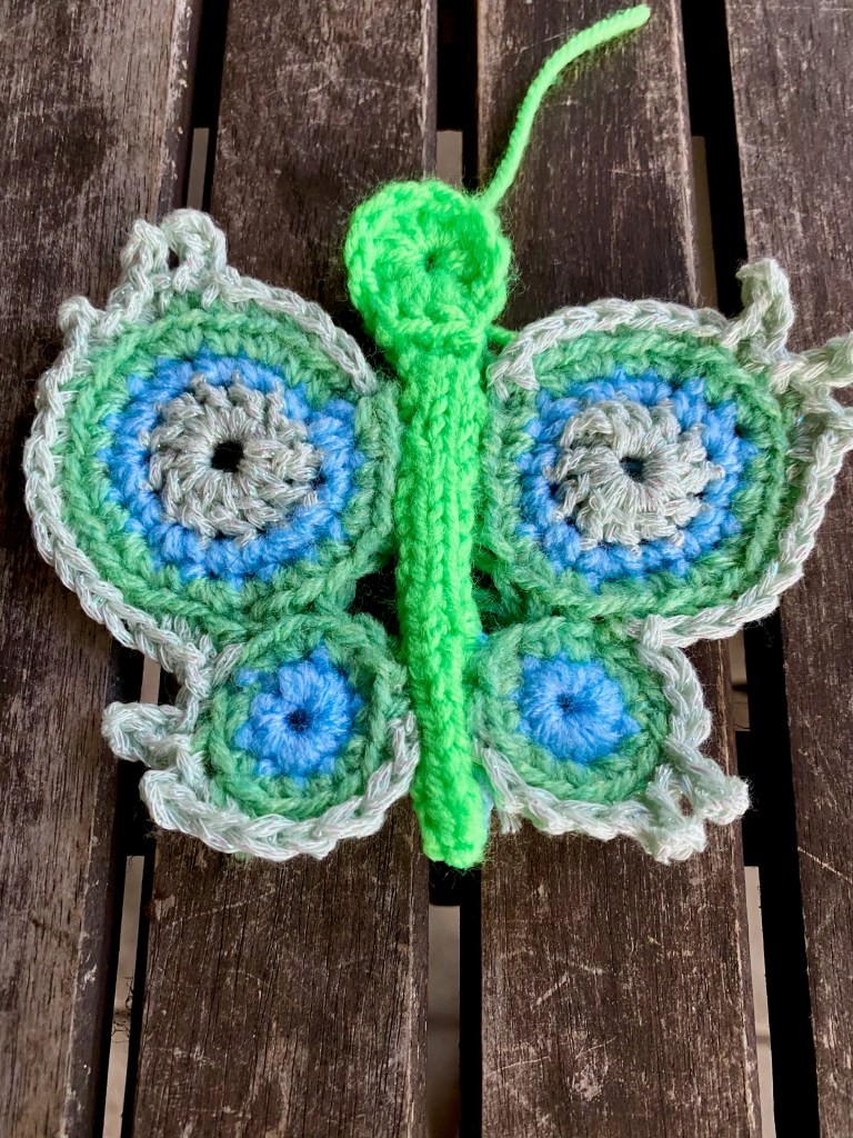
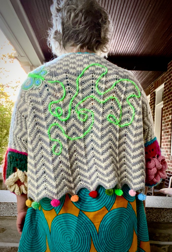
I thought this jacket would be a good vehicle for a crocheted butterfly appliqué that I devised about a year and a half ago to cover a burn hole. I couldn’t remember how I had done it, so I went back to the instructions I wrote in the blog post about the chain of disasters that required a crocheted butterfly patch. I published the post as a pattern on Ravelry, and someone made the butterfly and told me I had made a mistake in writing the directions. I had a crocheter friend take a look at my instructions, and she said they were clear and accurate, so I didn’t make any changes. When I made the butterfly for this jacket, I had so completely forgotten how to do it that it was as if someone else had written the pattern, so I followed the pattern as if I had never seen it before, without any problems at all.
As for the colors of the butterfly, I went back to my box of leftovers from the Adinda shawl and plucked out the skein of sparkly green-gray cotton tape that had originally served as an accent in Adinda’s design. Using other shawl leftovers, I built a rough gradient with a light blue and a medium green for the concentric circles of the large circles and the small circles of the wings, and a vivid lime green for the body and head. I was very happy with the way it came out, but when I laid it down on the knitting with the other motifs, it didn’t fit. It was too big, and there was no room for it on the front, where I had wanted to make a stream of colored crocheted balls forming a swirling flight track behind the butterfly as it flew up onto the shoulder of the jacket. I put the butterfly aside while I made the other design elements.
When I finished knitting and assembling the pieces of the body and attaching the crocheted sleeve squares, I started making pompoms. The pompoms were an essential design element, and all the other embellishments needed to be compatible with them. Having the pompoms in place helped me to resolve my doubts about the pockets, because the colorful little pompoms looked like gumballs, which reinforced the grandma’s-candy-dish look of the candy-striped circle. And then, because my imagination takes a violent and perverse turn when I’m getting too sugar-and-spice-and-everything-nice, I started seeing the candy-striped pockets as bombs with shrapnel of gumballs and Skittles exploding out of it.
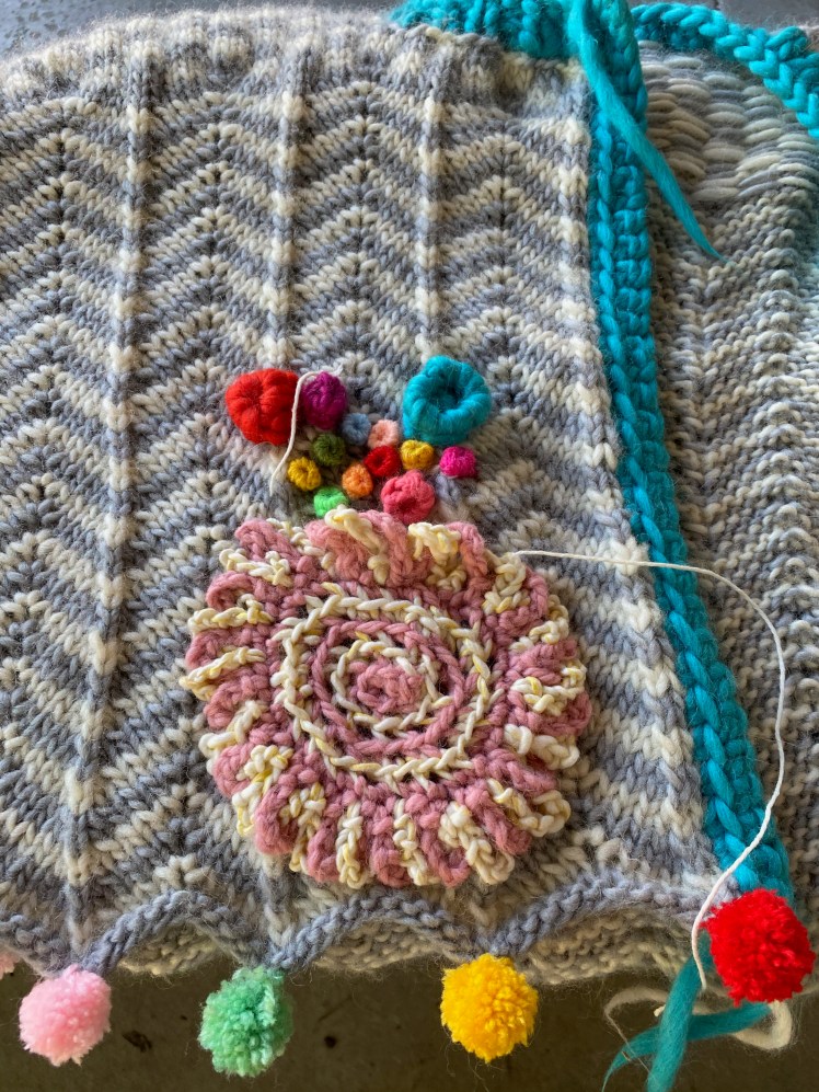
Now that the jacket was assembled, I could see where the pockets needed to be positioned for function and aesthetics, and I sewed on the first pocket. The top of the circle flops over a bit, which kind of suggests the look of shrapnel blowing up out of a bomb. But probably that’s just me. I crocheted yarn of different weights according to Adinda’s instructions for the dots that I used in her shawl. I clustered the dots more closely near the opening of the pocket, then spread them out farther up the fronts toward the shoulder. I attached each dot as soon as I finished the crocheting, and then had a lot of fun playing with the feel of the attached dots. It’s a gratifying tactile effect. Ends, you say? Ends schmends, say I. I didn’t bother trying to eradicate them. I just cut them if they were long enough to be visible on the right side. The inside is furry with ends. Sue me.
Having done what needed to be done to the fronts, including crocheting a button band and knitting a mitered neck band in thick turquoise yarn and sewing on the lavender-pink ceramic rose-shaped buttons, I needed to find a happy home for my sparkly butterfly. All of the real estate on the fronts was occupied, and it wouldn’t have fit there anyway, so that happy home had to be on the back or the sleeves part of the drop-shoulder body shape. I put the jacket on and told Melissa to find a good place for the butterfly, so she chose the position on my back left shoulder and pinned it on. The plan was to sew on the butterfly and embroider the antennae and embellish the back with a looping flight track wandering all over and ending up about a half inch from the back end of the butterfly.
Sewing isn’t one of my strongest skills, but I sewed it on pretty tidily. Then I needed to embroider the antennae, and I really don’t know how to embroider. I have done a little bit of visible seaming lately, which mostly consists of sticking a threaded needle into the fabric and pulling it out on the other side and trying to keep the length of the stitches and the distance between the stitches more or less regular. The embroidery for the antennae and the flight path needed a solid line curving this way and that, and I stumbled around with the needle and yarn until I figured out how to make the stitches overlap without a gap while also going in the desired direction. I got better at it with practice. The final loop heading in toward the tail of the butterfly looks a lot more confident to me than the wobbly curves and loops at the start of its flight. When I first started the flight track, I was worried that the lime green didn’t have enough contrast with the white and gray zigzag stripes. The value of the green is not so very different from the gray and white of the background when seen in gray scale, but I think the lime green vibrates against its background, and I like that effect.

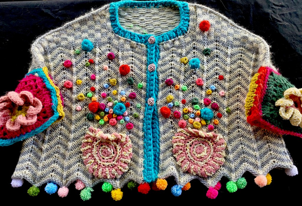
Like a lot of my work, this design is not exactly minimalist, and those who find color vulgar and prefer the understatement of choosing one theme and sticking to it will probably not love what I have done here. There are a lot of elements in this design: zigzag striping in white and gray that morphs to a checkerboard in the knitted base of the body; large crocheted squares with floppy flower centers in bright and purposely varying color combinations; a crocheted circular pink and white motif for the pockets; bright-colored pompoms at the points of the zigzag hem positioned without a rota; crocheted dots repeating the colors of the pompoms and sleeve motifs, in various sizes and distributed with intentional randomness; vivid turquoise button band and neck band; dusty pink rose-shaped buttons; blue-green gradient butterfly; lime-green curvilinear embroidery. It could have been chaotic. I don’t think it is.
This composition is another product of design principles I have discussed in this blog. White plays an important part in this piece, but I have thoughts about white. Lots of thoughts, which I expressed in detail in my post White: Color’s Secret Frenemy. (Post-publishing note: For some reason the link doesn’t work, but don’t believe WordPress when it tries to tell you the post isn’t there, because it is, and it’s relevant. Go to the search box and search on the post’s title, and if that still doesn’t work, go into the blog archives and search in August 2016.) The basic thesis is that white makes bright colors look harsh, unless these colors are very carefully selected to minimize the extreme contrast with the white. I wrote the post four years ago, and I thought I had gone into much more detail than I did about my observation that white can cooperate with colors if it is paired with a neutral like brown, gray, or black in a graphic alternation, but I didn’t say much more about that proposition than to wonder if the pairing with a neutral keeps white too busy to do its mischief.
I think I can express that now in less anthropomorphized terms. A black-and-white or gray-and-white or brown-and-white geometric alternation neutralizes the harsh effect on colors and instead brightens them because the other neutral serves as a bridge between the stark contrast between white and bright colors and reduces its extremeness and harshness. My earlier blog post discussed why white looks better with gradients than with unrelated bright colors. This is an extension of the idea that this extreme contrast needs to be relieved, a service that a second neutral performs for white and colors. Therefore the interaction of gray and white in a zigzag stripe enables me to use bright colors more successfully than if the bright colors had been on a solid white background. White + neutral + graphic pattern makes colors look fun and happy. The white confers cheerfulness. The neutral distracts the white from being a jerk. And now I’m back to anthropomorphizing.
Someone on my Ravelry group gave me a nice compliment while the jacket was still in its beginning phases, when I was describing all of the design elements I was planning to put into this jacket. She said it sounded like a lot, but that I would make it work as I always do. What I have learned about “making it work” is that lots of design elements can be incorporated into a composition if there’s a reason for all of them to be there. There should be a relationship between their colors, shapes, proportions, and themes. Repetition and variation are my favorite ways to make multiple elements make sense.
Circles play a major role in this piece. I needed the pompoms, a three-dimensional circle, to physically make the zigzag hem pointier, and they repeated a lot of the colors that I had used in the crocheted flower motifs of the sleeves. The dots of various sizes repeat the circular shapes, colors, three-dimentionality, and materials of the pompoms, and the absence of rota in their color use reinforces the absence of rota in the colors of the pompoms. The pockets are two-dimensional circles with concentric stripes and radiating stripes in pink and white, echoing and varying the gray and white zigzag stripes of the knitted base of the body. All of the colorful elements look sugary and edible, which made me think of candy shrapnel exploding out of a candy bomb and provided a unifying theme.
I had originally hoped to put the butterfly on the front, but it was too big for the available space, so I put it on the back and let it dominate that space, with a day-glow green looping flight track wandering all over the back. The turquoise button band and neck band repeat the turquoise in the big crocheted dots, and turquoise has an affinity with gray and white. The dusty pink ceramic buttons refer to the pockets in color and shape. The flowers of the sleeves have a similarity to the pockets because of their circular centers and the radiating petal shapes.
My operating premise is that the eye will not only accept a great many design elements before it overloads, but will welcome them, as long as it discerns relationships among them. The human brain is set up to seek patterns among varying things as well as between similar things, and in fact it especially enjoys the varying things because it hates being bored as much as it hates being overloaded. In fact, it might hate being bored even more than it hates being overloaded, at least my human brain does. As I have said before on this blog, it’s all about that dance to establish pattern, disrupt it, and reestablish it.
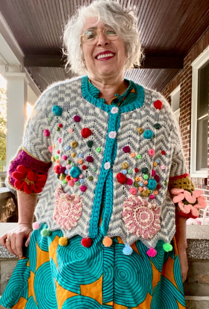
The theoretical aspects of design are very interesting to analyze, but if I’m making a garment, it needs to function as a garment, not just as some mere object d’art. Here it is, the garment, front, back, left side, right side.

I like the sweater and I appreciate that you share your creative process. I am inspired.
LikeLike
Thanks so much!
LikeLike
Good, detailed analysis of how the colors and shapes work together to create a design rather than a random mess. And of course, I love the jacket.
LikeLike
Thanks, Gretchen! It’s fun to dissect the method behind the madness. Was it you who posted the original inspiration?
LikeLike
It was! I love them both.
LikeLiked by 1 person
I’m so glad you clued us in!
LikeLike
“The neutral distracts the white from being a jerk.”😁… Now that’s a great way to describe the relationship between the colours! Really interesting breakdown of how the design works, and a beautiful finished piece.
LikeLike
So glad you enjoyed it!
LikeLiked by 1 person
I love this project!! I appreciate how you take us through the process, from inspiration to completion. This sweater is so fun! It looks adorable on you, especially with that dress.
LikeLike
Thanks so much! I wonder if my explanation of the design principles I apply to my work is helpful to other people’s process.
LikeLiked by 1 person
I am sure it is, if in no other way than to inspire them to take chances and go with the flow.
LikeLiked by 1 person
Thank you for that! Everyone’s mind works so differently than anyone else’s.
LikeLiked by 1 person
Thank you for describing your process. I just love this cardi
LikeLike
Thanks so much, Pat!
LikeLiked by 1 person