
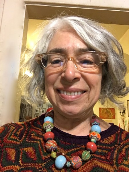
My sister Nancy is a jewelry artist. She has mad OCD technical skills and a brilliant eye for color and design, and luckily for me, she’s very generous to her sisters. She sent me a necklace that she made after she saw photos of my January Swatchathon pieces, the ones made from my plant-dyed yarn, because she thought it would work well with the colors. Here’s the selfie I sent her as soon as I took the necklace out of the box.
Then I photographed the necklace together with the swatches.
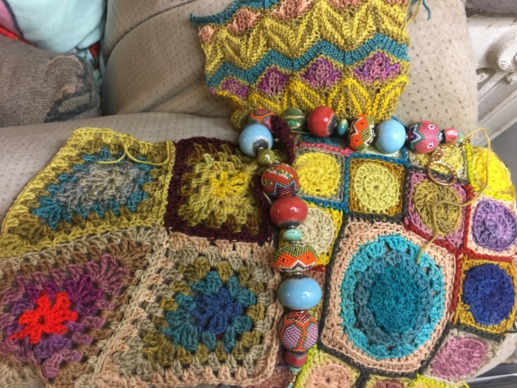
And suddenly I fell in love with that orange bit in the lower left hand corner that I’d had misgivings about when it was in a smaller context, although I’d had faith that it would work out when I wrote it up in the January Swatchathon post:
That orange spot is disturbing in its limited context, and it needs more interaction between the natural colors and Wollmeise’s acid-dyed colors before the orange will have the desired effect of waking up the eye without sticking out like the proverbial sore thumb. In order to get the effect I’m envisioning, I would need some additional number of diamonds that emphasize the natural colors and get the shape delineations from the contrasts within that range of colors. After there’s some space in which the natural colors establish their dominance over the design, then the acid-dyed colors can shake things up in a pleasing way.
When I put those three swatches together with the necklace, I attained that critical mass of natural colors that was needed to make the Wollmeise colors stand out without hijacking the whole composition, while the orange in Nancy’s necklace, along with the purple and blue, offered cross-references for the Wollmeise colors. Also that dark red-brown outlining one of the Granny Diamonds no longer looks as obtrusive as it did when it was such a prominent part of only four diamonds out there in a single isolated swatch.  That’s because the dark outline of the diamond is cross-referenced by the dark outlining of the squares in the swatch next to it.
One of my color truisms is that if you put in a color and it’s immediately disturbing, don’t take it out. Let it sit there while you plot its triumphal return, working around it until you drop it in casually somewhere in a different context, like it was always there and always supposed to be there. When you put in something weird and unexpected and it somehow works, people think you’re a color genius. Another shortcut to making people think you’re a color genius is to use orange. It seems like such a shocking and outré color, but it’s actually compatible with pretty much the entire color spectrum. Orange is like one of those scary fanged dogs that run up to you not to kill you but to lick your hand. Using it only looks daring, but in fact it’s a safe choice. Use discretion, of course. Done wrong, any color can look ugly.
(As I was falling asleep last night, I was thinking about colors that would look truly ugly in this environment. Blood red? Hot pink? Hmmm, sounds like a fun challenge to take a terrible color and make it work.)
Over the last three months, I’ve been doing more plant dyeing using walnut hulls, maple leaves, avocado skins and pits, red onion skins, and black beans, and I have 20-odd new skeins in various shades of browns, greens, dusty rose, and blue. Of course they are destined for the project based on the crocheted squares swatch. I laid the swatches and necklace on top of the pile of skeins.
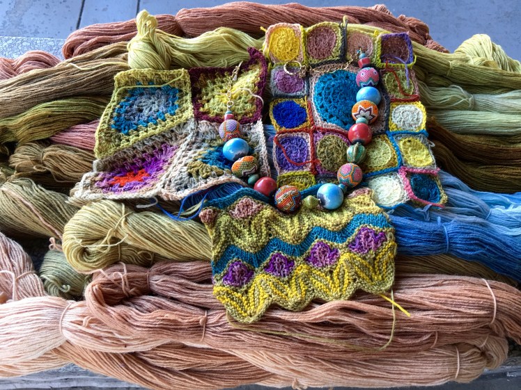
I can’t wait to use these additional natural colors in gradients and contrasts that will add range and depth to the natural colors I made in my first experiments with dyeing. The magic of natural colors is that their shared organic basis makes any hue a happy pairing with any other hue. Now that’s a cheap and easy way to look like a color genius, when anything you put next to anything is destined to be beautiful.

My sister gives me too much credit. She taught me the value of orange at least four years ago when she made me a hat that had an orange Pom Pom on the top. It knocked me out and changed forever how I look at orange. And olive green. And dusty rose. Thanks, Abby. You are the color maven.
LikeLike
Shall we just agree to have a mutual admiration society?
LikeLike
What can I say, both my sisters are geniuses. Abby, I love the new plant-dyed colors, especially the blue. Black beans?
LikeLike
Yes, the water black beans get soaked in before cooking. It’s a great dye. I’ll write about it in the next post, which I’m planning to publish sometime this week.
LikeLike
for a fabulous orange you should try growing some orange cosmos this summer.
I have seeds if you want some.
another brilliant orange is the wild jewelweed plant. unfortunately the Japanese Beetles love jewel weed too so in my area it has become harder to find growing in the ditches.
LikeLike
I don’t garden, but maybe I can get my sister to grow some. Thanks for the suggestion!
LikeLike