
My mission for the remainder of my life is to knit through as much of my stash as I can before I die, while also supporting my friend Melissa’s yarn shop with as many new purchases as I can actually knit up. When I finally succeed at knitting up these purchases (or to be honest, anything at all), it feels like a small miracle, neutralized on the balance sheet by some other purchase that I have made in the meantime. But I will celebrate the small miracle of finally knitting up a bag of yarn I bought in January 2024 for the pants and pullover from the cover of Pom Pom Quarterly’s last print edition, Fortuna’s Wheel Trousers and Fortuna’s Wheel Pullover. I finished the pants last fall, but the yarn for the pullover sat there like a reproach until after my daughters’ birthdays, after two versions of a defective pattern that I undertook as a knit-along with Melissa, after January Swatchathon, and after my sister’s birthday present. But after all that, I embarked on the pullover.
When the pattern first came out, there was a storm of early-adopter projects, mostly in the black and white of the pattern sample. The op art patterning was so perfect in graphic black and white that it was hard to envision it in any other color pairing, and the first projects all looked just as good as the magazine’s sample. But they all looked alike. Except for one, the one by my Ravelry friend Mariagioia, a genius from Italy, whose stroke of genius was to duplicate-stitch just the right number and just the right placement of light and bright colors in white rectangles on the front. It was unforgettable. I haven’t shown her project because I haven’t asked her permission, but if you have a Ravelry account, you won’t be sorry that you looked through her project page to check out her Fortuna’s Wheel Pullover. Come for the Fortuna’s Wheel Pullover, stay for everything else.
My version was going to be different from the first batch of Fortuna’s Wheel Pullovers, because I bought forest green and leaf green for the trousers and teal green and leaf green for the pullover, for the sake of a slight variation in a unified whole, so that it would look like an outfit rather than pajamas. I used my already-knitted pants as a gauge swatch, and my gauge was larger than the pattern’s gauge. I did some arithmetic and chose a size whose stitch count would get me the positive ease I wanted. As I do when I like a pattern as-is, I try to follow the instructions literally until they don’t work anymore. This one has an unnecessarily complicated way to create the top-down neck opening that called for crocheted provisional cast-ons at the front and back, then cable cast-ons to create the curve of the neckline. The provisional cast-on added time to the start of the project and saved no time at all at the neck band stage when you have to pick up stitches from edge of the cable cast-on, and it didn’t look any better than picking up the stitches for the neck band from an ordinary cast-on. But I did the provisional cast-ons and the increases and joined the pieces as instructed, and established the patterning. Once it was all in one piece and the grid pattern was in place, the raglan increases were easy and intuitive, and I could knit the knit-purl stranded patterning on autopilot, having knitted this patterning fairly recently for the pants.
As I got deeper into the yoke, I had some indecision about which size instructions to follow for the yoke-body division. I couldn’t decide when my yoke would be deep enough until I closed the gaping hole of the huge neckline that the pattern instructions prescribed. Again, I followed the instructions as written. The corrugated ribbing made a large but wearable opening at the neck and shoulder, but I got more and more doubtful when the rolled edge that finished the neck band went on so long it could have been its own sweater. But I was curious, so I kept on knitting, and sure enough, it was floppy for no good reason, and it looked awful.

Then I went back to the pattern’s project gallery on Ravelry and read the knitters’ project notes. Everyone hated the neck and modified it in some way. Someone pointed out that the reason the pattern’s sample looked all right in the pictures was because the photographer (who obviously also hated the neck) put it on the model backwards and probably pinned it to hide the floppiness. Most likely there wasn’t time in the publishing schedule to send the designer home to to reknit and rewrite the neckline, so the photographer resorted to deceptive photography.
My modification was to keep the corrugated ribbing but rip out the 11 rows of rolled edging and replace it with 1×1 ribbing for six rows and five rows of rolled edging. I did eight double decreases, at the four raglan lines and two each in front and back, evenly spaced, in the row before the start of the ribbing, so I guess it’s more accurate to say there were five rows of ribbing, but it looks like six. My neckline is looser and draftier than optimal, and I find myself clutching the excess fabric in the neck to keep drafts out, but at least it looks as if it’s supposed to look the way it does.
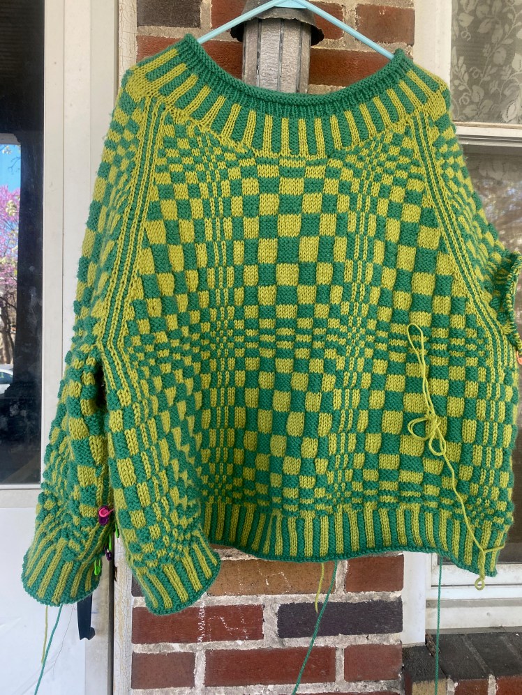
Having made the neckline and seeing how the yoke was lying on my shoulders, I decided to follow the numbers for the next size larger. A marketing feature of Pom Pom patterns is that they are size-inclusive, but the bug in that feature is that the instructions for each size haven’t been test knit or tech edited, so you can count on there being something in whatever size you’re knitting having something missing or not adding up, which was the case for the instructions for joining the body to the yoke at the armpit. So I wasted a bit of time scrolling through 60+ pages of online charts (the charts for almost all of the sizes can only be found online) before I decided I was on my own to use the numbers and make it work. From there, I knitted on autopilot down to the hem, which I knitted according to the instructions, although I improvised a sewn bind-off that might not be standard, but it’s consistent and tidy. Then the sleeves. I thought I had made them plenty long, but I’m wearing it right now as I type this part of the post, and I wish they were two inches longer. No reason why I couldn’t frog the cuffs and add two more inches, except that it’s a big headache and I don’t want to.
The knitting was done, but I wasn’t done. Finally it was time to shamelessly copy Mariagioia’s duplicate stitch inspiration. But I couldn’t literally copy Mariagioia’s color usage because her base colors were completely different from mine. So I analyzed what she did and boiled it down to concepts, which I then copied.
I tried to translate what Mariagioia did on a background of black and white, to my background colors of a lighter leaf green and a deeper blueish green. Mariagioia never used any color that was anywhere close to the darkness of the black, because that would have interfered with how the op-art checkerboard read, and she used a lot of very pale pastels that you can hardly see, and a saturated red that jumps out at you against the black and white but doesn’t compete in value with the black. She also colored two squares per pattern repeat, for a total of 12 embroidered squares. That was the perfect number for balancing between a random-ish distribution that left enough of the original patterning untouched so that it could do its op art magic, and going completely overboard, which would have been easy to do, because embroidering the squares was a lot of fun. So I also made sure to stop at 12 squares, although my distribution of the embroidery was a little different from Mariagioia’s, only because I hadn’t yet completely figured out what Mariagioia had done before I leapt in with my first few squares.
So I derived some principles from what Mariagioia did: no colors had the same value as the darker green, only colors that had a lesser or only slightly greater value than the lighter green. The embroidery on the hem and neck ribbing was a logical extension of the embroidery in the patterning, and when I saw how the pale neon green square jumped out without interfering with the patterning, I decided to use the same color to outline the center line of the raglan striping on the opposite side of the sweater from the neon green square. Not interfering with the optical tricks of the basic patterning was essential, so I resisted the urge to duplicate-stitch over the 1- and 2-stitch and 2- and 3-row parts. Those stitches and rows are the elements that give the patterning its dimensionality. Don’t mess with them, they have a job to do.

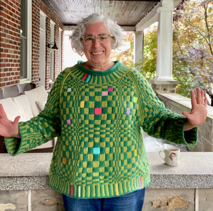

I think the secret to the success of the duplicate stitch embellishments is restraint. Restraint in color selection, restricting the colors mostly to hue contrasts rather than value contrasts, and restraint in the number and distribution of the color pops so as not to overwhelm the basic op art checkerboard, which was the reason for knitting the pattern in the first place, in two different articles of clothing.
I might finally be finished with this chart, which I’ve been working with on and off for at least six months. Or maybe not. What if I poked the chart into my KH965i’s memory and made cool machine-knit stuff with it???
And the completed outfit:


ahhh! You never cease to amaze me with your colours and artistry!! GGGGreat!
LikeLiked by 1 person
Thank you!!!
LikeLike
Absolutely SMASHING ❣️❣️❣️❣️Congratulations – how wonderful to see your creations
LikeLiked by 1 person
Thank you so much!
LikeLike
Delightful.
LikeLiked by 1 person
Thank you!
LikeLike
Wow. That is a lot of stitches.
LikeLike
Just a sweater’s worth of stitches.
LikeLiked by 1 person
My own thanks to Mariagioia, for through her inspiration, we all get to enjoy the results of your inspiration!
I love that you mention going to the comments on the pattern page in Ravelry, for I have now learned to go straight there to get a sense of what thoughts, problems, praises seem to be rising to the top for a given pattern – it could be so many different things that generate the comments, and who would’ve thought the neck would be such a big deal?
Your iteration of the Mondrian-esque colored squares is brilliant, and just positively delightful. It’s such a treat when a piece has this sort of aspect that catches the eye, and grabs hold tightly of the emotional response: who could see this and not have something akin to, “OMG, that is FABulous!” in their thought bubble.
And you were so right to choose to carry one color through from the pants, and to change the second. It looks like a lovely, coordinated outfit, and not the pajamas you so rightly feared they could become.
The sweater looks very warm and terribly comfy!
LikeLike
How did I miss this detailed analysis for so long? Thank you for your insights! And the compliments!
LikeLike