
For the last three months, my handknitting life has been dominated by one pattern, knitted twice in very different colorways from yarn in my stash. The yarn that prompted my interest in this one versatile pattern wasn’t originally from my stash– I inherited it from a woman I never met, who destashed it to my yarn store owner friend Melissa, who bestowed it on me, as I detailed in my post Melissa’s Largesse. It was a sweater quantity of beautiful brown alpaca worsted yarn by Rowan, enough for a plain stockinette pullover or cardigan. I don’t knit plain stockinette unless I can do it on my knitting machine, because plain stockinette doesn’t soothe me, it anesthetizes me, and this yarn was too thick for my standard gauge Brother. So I went on the hunt on Ravelry for an idea or a pattern that would use the yarn in a way that would hold my attention.
Meanwhile, my daily perusal of my friends’ activity on Ravelry drew my attention to an Italian knitter’s particularly beautiful version of Caitlin Hunter’s Festive Doodle, knitted in Wollmeise fingering weight yarn. My stash has several lifetime quantities of Wollmeise in laceweight, fingering weight, and DK, and I started thinking about knitting the pattern in Wollmeise DK. I also started thinking about knitting the brown alpaca in Festive Doodle, combined with sport weight alpaca in natural colors, which had been sitting in my stash and begging me to knit it for the last three years. I swatched each set of yarns during the January 2022 Swatchathon.


When I was stash-diving for yarn for the Wollmeise version, I found myself gravitating toward aquas and rusts/dark reds, contrasted with a gray with a green undertone, and splashes of lime green and orange to make things livelier. That was enough to get my swatch going, but the composition wasn’t quite right. My subconscious and my optic nerve took me the rest of the way to my organizing idea, when I got a retinal image of aqua, green, and purple glowing fuzzily out of a misty background. In my stash I found several colorways of gray-dominant yarns with blue, aqua, green, and purple tones that gradated pretty smoothly, and I decided to use this gradient as the organizing feature of the composition, sometimes with colors glowing fuzzily out of it and sometimes juxtaposed against a series of high-contrast colors. A lot of people think that low-contrast color combinations are a terrible design gaffe, and often they are. But I use them intentionally as a design feature because I like the way they slow down the movement of the eye as the brain deciphers where one color ends and and another color starts.
So this begs the question: why does low contrast work sometimes and look terrible other times? Several factors in my usage. First, it has to look intentional. The motifs need to be large and solid enough to show the difference in hue, or you have to want the colors to blend into each other. The other thing that makes low contrast work is whether it’s worth the viewer’s while to look closer to see what the low contrast is hiding. Think of a Rembrandt group painting. As you’re in the museum walking by quickly, you see the highlighted faces right off. Then you see a spot of light coming out of the murk, and you stop to check it out. The light is bouncing off of what turns out to be a nose attached to a mostly concealed face, and as you look, you start to see yet more faces, really interesting, individual faces, all of which tell a story and make you glad you stopped to do the work of looking closely. I’m not comparing myself to Rembrandt, but that’s the power of low contrast done well.
My goal is more modest, which is to activate the rods and cones in the viewer’s retina in order to replicate my retinal image inspiration and to ask the viewer to detect the similarities and differences between the contrasting colors. For me, that’s a really interesting exercise. This exercise is not necessarily to everyone’s taste, and I relieve the eye from excessive labor by providing high contrast areas for every low contrast area. Also I wake the eye up by having some neon colors shine out of the low contrast arrangements– I don’t want to lose all of the viewer’s goodwill by making them work hard to decipher something that isn’t a Rembrandt group painting. Also I like high contrast as much as anyone. But I think balancing high contrast against low contrast enhances both. A lesson from Rembrandt.
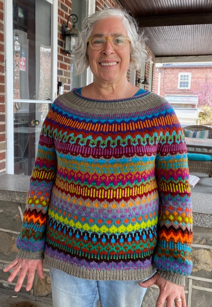
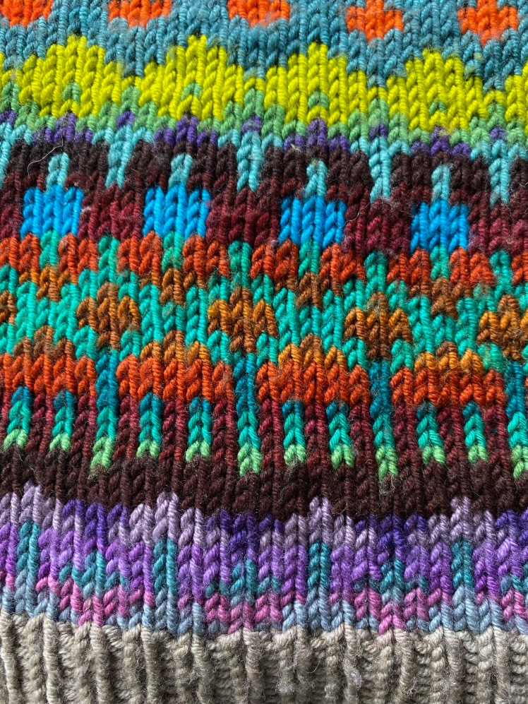
Since I often get compliments on the colors of this sweater from passersby, I can assume that the composition is pleasing at a quick glance, without requiring the viewer to get into a deep dive to sort out the blurry parts, like focusing only on the illuminated faces in a Rembrandt and then moving on. That’s fine with me, because I’m glad to have people engage with the composition with whatever attention they want to direct at it. Being intimately familiar with how and why I chose the colors I chose and placed them as I did, I get a lot of pleasure from looking at the sweater in low light or at a medium distance, because the lower visibility blurs the boundaries of the color changes in the gradients and makes them look smoother and more like the retinal image that guided my choices. In brighter light and at close range, I like to look at the sleeves below the orange zigzag to see the hue distinctions between the same-value turquoise and amber brown and the amethyst purple and grayish aqua right below. Those color sequences echoed, but didn’t replicate, color sequences at the same latitude at the bottom of the sweater toward the hem. In that part of the sweater, I really like the way the turquoise goes from a high-contrast pairing with a dark brown that gradates to the much lower contrast of the amber brown and rust. The composition looks very different depending on the light and from what distance it’s being viewed, which is the kind of under-the-surface surprise that entertains me a lot, even if I’m the only one who perceives it.
Here are some parts of the composition that I like looking at.


As soon as I finished Retinal Doodle, I started Neutral Doodle. The Festive Doodle pattern is a pleasure to knit, with completely accurate numbers and clear, uncomplicated explanations of the construction (of course, it’s a basic top-down yoke, which is as uncomplicated as it gets), but the one thing I didn’t love about the pattern as it was written was its open, drafty neck. If it’s cold enough for me to wear a big stranded sweater, I don’t want my neck exposed to drafts. So I reduced the number of stitches I cast on by a factor that would enable me to do three sets of increase rows, adding stitches at even intervals on each increase row, to get back to the number of stitches that the pattern starts with. Then I rearranged the short rows that shaped the neck so that the neck was rounder and covered the sides of my neck, the tender part, rather than producing the boat neck of the pattern instructions. Loose wobbly necks seem to be a characteristic of top-down construction, I think. Usually I knit bottom-up because knitting from that direction gives me a better handle on fitting the neck. But maybe that’s just my own technical deficiency and if I were more experienced with top-down, I could customize the neck as I prefer.
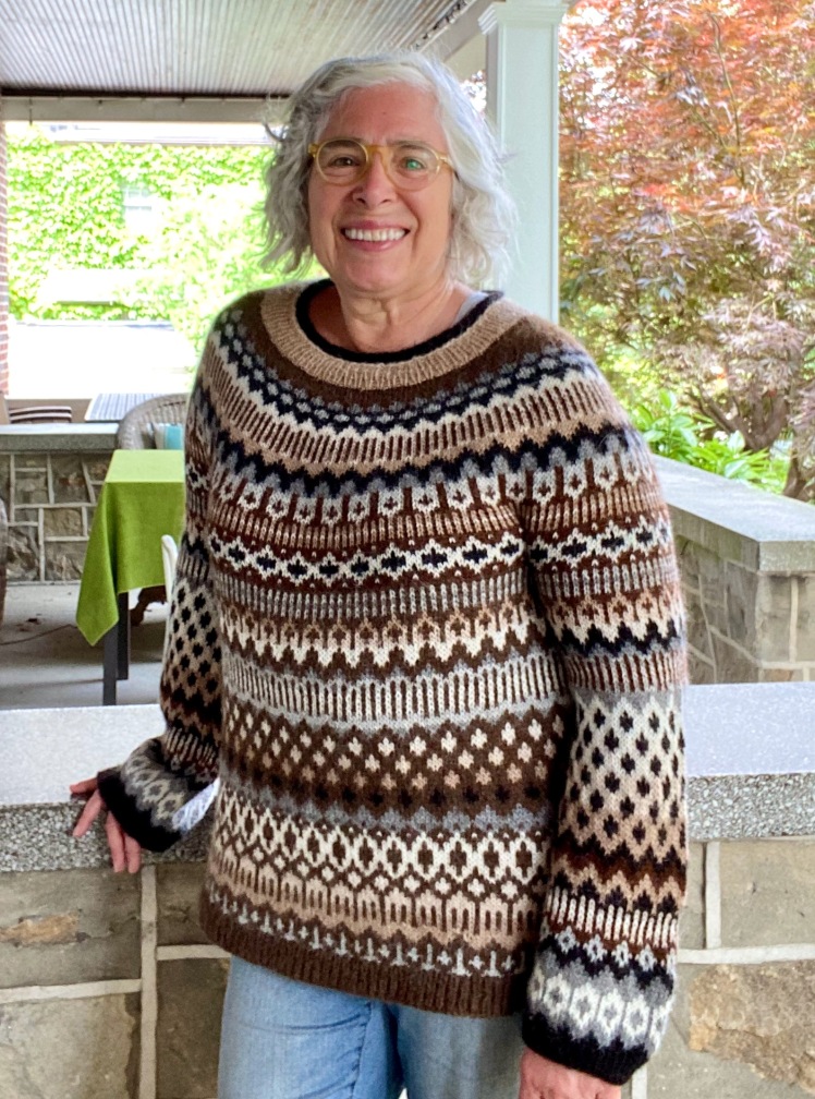
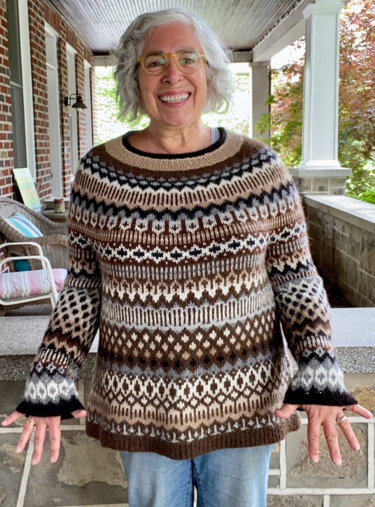
The point to this Doodle version was to use the brown alpaca worsted that I’d been given without running out. To economize on its usage, and also to save me from the brain-deadness of monochromatic stockinette, I paired it with thinner alpaca sport weight yarn in a variety of undyed, natural alpaca colors. The worsted/sport weight combination produced a heavier fabric with a larger gauge than the sport weight pairings, so I knitted the worsted/sport weight parts on a needle a size larger than the sport weight parts to equalize the feel of the fabric. That meant that I would get a larger gauge in the knitting where I used the worsted weight yarn, so I used the sport weight yarns in the yoke and arms and the worsted weight in the body to provide a bit more ease where I need it. This dictated a design decision. In the body, the worsted weight was to be used in every row, so that brown was a constant and the sport weight colors needed to contrast with it. I had a deep brown in sport weight that was too close to use there and a natural black that gradated with the brown, so I had to use that carefully in the body. In the body, my color pairings were limited by the fact that the brown worsted had to be one of the two colors and the other color needed to contrast with that brown. But I could use any combination I wanted to use in the yoke and arms because brown wasn’t hogging one color in a two-color pairing.
Here are a couple of detail shots of the body, where the brown worsted had to be used in every row and lighter value grays and cream/beiges were the contrast colors.


In all parts of the sweater, I used gradients lavishly, to the extent that the colors available to me permitted. My options at the dark end of the range were limited, because I just had darkish brown and natural black. At the light end, I had four white-to-tan colors that gradated very smoothly and two grays that gradated less smoothly with the white, but the grays could be made to gradate where the pattern gave me areas that I could divide up into two-row segments that would enable the grays and white to blend into each other. After I finished knitting the body and had more latitude in my color choices for the sleeves, I decided to try to reverse the value dominance in the body. If a dark value dominated in the body, I had the sleeves use light colors as the background in the knitting that would line up with that part of the body when the arms were hanging down at rest by my sides. The patterning in the sleeves is different from the body after the dots, but in the lower part of the sleeves I made the background dark because the background in the body is generally light toward the hem. That design decision doesn’t really jump out because the patterning is so different from the body there.

My palette of undyed natural alpaca colors limited the range of hues that I could use to differentiate between color pairings, so the organizing principle for the color arrangement of this Doodle version had to default to value contrast. The high contrast in a limited hue palette, combined with patterning that reuses a number of motifs in varying riffs, causes the eye to move repeatedly over the fabric to register the similarities and variations in the patterning. There’s no low contrast to slow down the eye to decipher the shapes in the stranding, although there is latte and tiramisu shading within the light part of the contrasts, so the eye moves like a pinball from here to there and back again and then somewhere else. Despite the fact that the colors in this Neutral Doodle are more limited and “quieter” than the colors in Retinal Doodle, I think that the effect of Neutral Doodle is jumpier and more kinetic than Retinal Doodle. There’s plenty of eye movement in Retinal Doodle, thanks to the orange zigzags and dots, the lime green vertical lines, dots, and diamonds, and the areas of dark reds and browns, but those parts stand out because because these bright colors sit in fields of gray gradients that semi-obscure motifs in colors with less value contrast. Those areas are speed bumps for a careening eye.

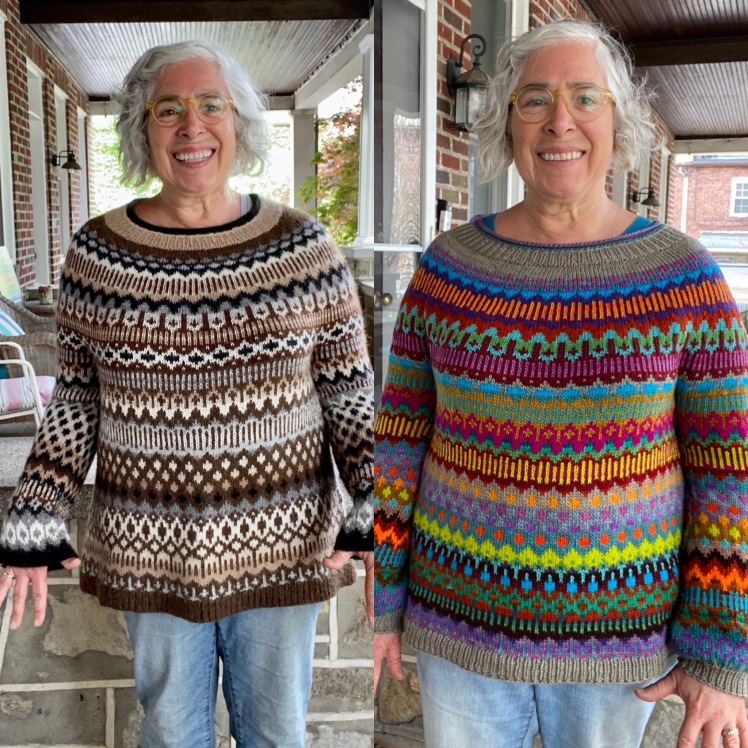
The particularly striking thing about a side-by-side comparison of these two versions of Festive Doodle is the way that the two color treatments emphasize different parts of the patterning. It’s remarkable to have made the two using the same pattern without any modifications and to have results that appear to have completely scrambled the order of the patterning. This is the power of value contrast.
Having made two versions of Festive Doodle, I can only praise the pattern. For both of my versions, I knitted the middle size, with a lot of appreciation for the simple elegance of the numbers, which grew incrementally to combine a stitch repeat of six stitches with a chest circumference whose stitch count is divisible by eight. It might sound quirky to love these numbers so much, but they are intuitive, easy numbers to knit. Some numbers make better sense than other numbers in knitting. Sixes and eights make sense. The yoke increases that built up to that happy confluence of sixes and eights were charted in a clever way that made the increases an organic and inevitable design element. The 6-stitch stranded pattern repeat meant that the floats were never more than five stitches, and the geometric shapes of the pattern motifs were intuitive enough to make it unnecessary to look at the chart after the first couple of stitches of each row, to see how the pattern starts. You start it and off you go. Stranded garment bliss.
And it turns out I miscounted the number of balls of the Rowan alpaca worsted. I had much more than I thought I had and didn’t need to find a pattern that economized on its usage. Now I have enough left over for another pullover paired with undyed alpaca sport-weight yarn to make sure I have enough of the worsted to get to the end. Stash-busting? It’s a myth.
Here are a bunch of mostly redundant pictures of me in the two Doodle sweaters and my cheesy model smile.


Thank you. Very interesting blog and two very different sweaters.
LikeLiked by 1 person
Thank you! They are pretty dramatically different From each other.
LikeLike
Loving them both – colours are gorgeous and both pleasing on the eye
LikeLike
Thanks for your kind compliment!
LikeLike
All of your work is wonderful, but I absolutely adore the neutral version of the Festive Doodle.
LikeLike
Thanks so much! I can’t decide between the two.
LikeLiked by 1 person