
This project was born from three factors: First, our potholders were full of burn holes and should have been replaced years ago. Second, I found a free pattern on Ravelry for a pretty flower-shaped potholder made of two crocheted circles joined together by a contrast color that delineates the last four rows of the pattern into the shape of petals. Third, we had a discussion on my Ravelry group “The Interior of My Brain” about using old stash, and my memory went straight to the place in our spare room where I last saw my cotton yarns from my First Knitting Era in the ’80’s and ’90’s. It would be a fine small project for January 2021 Swatchathon.
But I went to that place in our spare room and the bag of cotton yarn was not there. Was it underneath the papers and books that Charles has stowed there over the years? Could I have moved it somewhere? I searched the bags of long-neglected yarn from decades back hoping for anything cotton-like from before that time in the late ’80’s when I decided I didn’t like knitting with cotton and stopped buying it. Eventually I found 10 motley balls of various weights and consistencies and random unattractive colors. A rogue’s gallery of America’s Least Wanted Yarns.

The dark blue on the far left has a thick-and-thin texture that was trendy in the late ’80’s, which the pale white-pink-orange skein beneath it to its right also has. The vermilion orange next to the dark blue is chenille, as is the Kelly green at the right of the photo. The aqua in the center has a smooth texture with a shiny darker ply. The pink right above the aqua has a chained spin. The bright orange next to it is a worsted weight with a smooth spin, as is the slightly paler pink to its right. The yellow-orange is a mercerized cotton that is a lighter weight than most of the other yarns and would need to be held double in the work. The pale mint green is a bouclé and is a bit lighter weight than the other yarns.
Now the focus of the Swatchathon project changed from working to decode someone else’s instructions, which always is a challenge for me, to a Tim Gunn “make it work” challenge to use random oddments that you have on hand and make the result look as if you had your pick of anything in the world and these were the elements you had judiciously selected to achieve your master plan. The task was to bring coherence to this set of colors and texture within the framework of the pattern, which consists of seven rows that provide seven opportunities for color changes. First I grouped the yarns according to their similarities to each other: the saturated cool-spectrum colors, the dark blue, the aqua, and the Kelly green; the oranges; and the pale colors. The vivid colors looked harsh against each other, and the pale colors were very much less saturated than the bright colors. But the pale mint green bouclé was the closest thing I had to a bridge color, being equal in intensity to the pale pinks while its hue categorized it as a cool color with the blues and Kelly green. My strategy for mitigating the harshness of the colors was to arrange them in the smoothest gradients I could manage with what I had, to make the eye blur the colors together and soften the drastic contrast in intensity and make the hues clash less.

The first three rows of the pattern consist of double crochet rounds in concentric circles. That was where I made a pale gradient, with the thick-and-thin white-dominant yarn at the the very center and then the lighter of the two light pinks. Then I used the mint green bouclé as a way of introducing the cool colors that were coming next in my arrangement of the colors. The mint green bouclé was just a slight shade deeper than the pink in terms of intensity. I discovered early on in my Kaffe Fassett days that gradients don’t have to be based on hue, since the eye will blur the edges between colors if the two are fairly close in intensity. I started to congratulate myself on that decision after the next two rows, which were the aqua, a medium value with green in the color mix, and the dark true blue, which was a couple of clicks darker than the aqua, while the mint green was a couple of clicks lighter and triggered that eye-blurring that I like so much. That got disrupted when I put in the Kelly green to delineate the petals, but it’s useful information to know that hue pairings that are too dissimilar in value to gradate when it’s just the two of them, will gradate when a third color is introduced that is related in hue and has a difference in value that is opposite in the other direction from the disparity between the original pair. That is to say, the aqua is the center of an intensity sandwich with the dark blue and the pale mint on either side of it. I just wish that this effect was apparent in the finished version of the piece.
The final two rows were the deep orange and the even more intense vermilion. Orange gradients resonate with aqua gradients in a way that I really love, so I was feeling pretty pleased with myself for pulling off a success from such unpromising components. Now to make the second side. That was when my inner Tim Gunn said, “make it work again, in a different arrangement.”
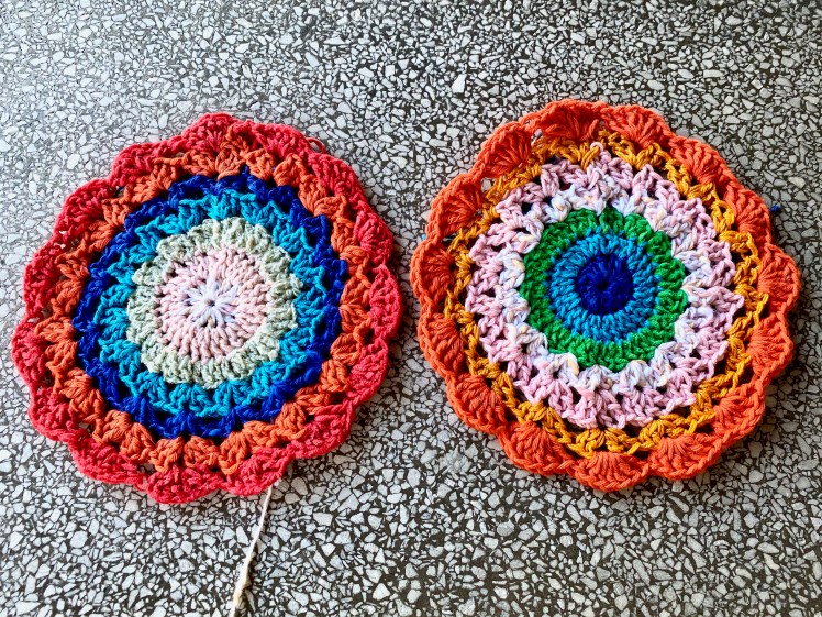
The organizing factor for the second side was the fact that the Kelly green would join the two sides and would be visible on both sides. Because there is so much disparity in hue and intensity between my groupings of these ten motley yarns, there’s really no way to avoid stark dividing lines somewhere in the seven rows of the pattern– not a bad thing, it’s a design feature. In the first side of the piece, that dividing line is between the dark blue and the lighter of the two oranges in the pre-finished version, and also between the aqua and the mint green in the finished version. So I decided that for the second side, the dividing line would be between the three rows of the concentric circles at the center and the four rows of shell shapes. The third row of the concentric circles would be the same Kelly green that would delineate the petals.
Since Kelly green was going to be the delineating color on both sides and I was going to have a dividing line between the color groups no matter what I did, I decided that on this second side, the Kelly green would be the third round of the concentric inner circles, the same color as the delineation of the petals. The second round would be the aqua, which was closest to the Kelly green in intensity value and hue. The first round was the dark blue, which was distinctly darker than the aqua and jumps out from the center like an Evil Eye amulet. I think the smooth blend between the Kelly green and the aqua emphasizes the contrast between the dark blue and the aqua, whereas in the first piece, the mint green contrasted with the aqua to a degree roughly equal to the contrast between the aqua and the dark blue. It may also be that the position of the dark blue round in the first piece as a final, relatively narrow line makes the eye blur the contrast between the mint green, aqua, and dark blue sequence.
After assigning the darker colors to the center, I arranged the four rows of the petals in a gradient of the warm colors progressing from low to high intensity. I used the white-pink-orange first, then the slightly more intense of the two light pinks, then the yellow-orange mercerized cotton held double, and finally the less saturated of the two bright oranges. Looking at the two unjoined pieces side by side, I didn’t like the way the second piece looked quite as much as I liked the first piece, because it looked like a Nazar Bonçugu (Turkish evil eye amulet), which is pretty but done to death, while the first piece had that interesting pair of gradients.
Then I joined the two pieces with single crochet stitches worked through both layers of the edges and into the inner rows of the pattern using the Kelly green, also worked through both layers. That completely altered the interaction of the colors in both pieces. It broke up the way the mint green in the first piece served as a bridge between the pale warm colors of the center and the saturated blues that followed. Now the design presented in three parts, a pale gradient center, a vivid blue inner section of the petals, and an orange outer section of the petals. It’s pretty but no longer shows the gradient that I was so pleased with. On the other hand, in its final form, I find myself really liking the second piece. The green of the petal delineation connects with the green row of the flower’s center and emphasizes the gradient of the petals, and the way the petal delineation connects with the green at the outside of the flower’s center unifies the color composition.


This exercise illustrates an important lesson that I want to emphasize. Yes, I did say some mean things about the colors. I called them unattractive and harsh. I said I don’t like mint green. No, actually I didn’t say that here. But in isolation, I don’t like mint green. In isolation, that’s the loophole. When you’re assembling colors in a composition, it doesn’t matter what colors you like. As my friend Linda likes to say, colors aren’t colors until they’re next to each other. Colors are chameleons that change their look depending on what’s next to them, so those colors you’ll never wear as a monochrome can be exactly what you need to build a gradient or ignite a previously boring color scheme (yes, orange, I’m talking about you!). In the case of mint green, I probably wouldn’t have recruited it to play the role of a bridge color if I had had a different pale green with stronger blue tints, but I used what I had, and until the Kelly green upstaged it, the mint green was the element that turned the blue sequence into a gradient. And of course, gradients are my favorite means to bring order to disparate components. This experiment interests me in further testing the proposition that every grouping of 10 random colors has at least one pathway to coherence.
P.S. Charles bought potholders from Amazon, three for $9. This potholder will never be used as a potholder.

Oh, I love how this turned out. I love the interior of your brain.
LikeLiked by 1 person
Aww thanks! I grew it myself!
LikeLiked by 2 people
Excellent results and analysis. Your concluding sentence has me reaching for scrap yarns, or for a box of crayons . . .
LikeLiked by 1 person
I would love to see what you come up with! It’s actually very difficult to come up with random yarns that really are random.
LikeLike
Of course, all my yarns were chosen because I liked the colors, so not a random assortment at all. Maybe, when get-togethers are safe again, a group swap of leftovers could provide materials for experimentation. Meanwhile, a random handful of crayons from the box of 64!
ps: if you have more of those thick-and-thin cotton or cotton blends from the ’80s, say a sweater quantity that you no longer want, I’m interested. Over the past several months I’ve been actively seeking them out on ebay and Rav stash sales, because I really love them for warm-weather sweaters. My old knitting mags of the era show so many appealing designs using them – so exasperating that no one seems to make them now.
LikeLike
I found two small skeins of the blue, but who knows what’s buried in the spare room. If I ever get to the bottom of it rather than leaving it for my daughters to shovel out along with my dead body that will be found underneath a yarn avalanche, I’ll think of you if I find a SQ.
LikeLiked by 2 people
Oh, the more I look at your projects the more convinced I become that you are a color witch. Can you learn this, or is it some kind of a gift?
LikeLiked by 1 person
I didn’t know I had a strong sense of color until Kaffe Fassett inspired me to start playing with gradients, and I recommend gradients as a way to learn about colors. Then you want to find out how colors contrast with each other and how the size of your motifs affects contrast. You can learn a lot by experimenting and by expecting results you don’t expect.
LikeLiked by 1 person