
A couple of weeks ago I posted a selfie of myself wearing my newly completed pullover paired with a scarf I had needle-felted a couple of years ago, and I got some nice comments from a couple of people who have known me for a very long time.

The first comment, from Lynda, complimented me on my ability to combine colors and patterns that ordinarily would be awful together, and make them work. That confused me for a little while. I hadn’t thought there was anything risky or controversial about the colors and patterning in the sweater, which are soft, natural hues of similar chroma in a cool gradient contrasted against a warm gradient in a positive/negative checkerboard arrangement, accessorized with a scarf in similar colors decorated with dots and wavy lines. Then I understood the context of the comment, which drew on longtime observation of my initial color experiments in the 1980’s and 1990’s under the influence of Kaffe Fassett and the excesses of the time. And yeah, I did some stuff that really shouldn’t have worked and now I’m not so sure it actually did, so I’m grateful for the generosity of that comment. I have been looking at some of my old work to analyze why it worked when it was successful, how I managed to pull off combinations that could have gone very wrong, and situations when I wasn’t as much as a magician as I thought I was at the time.
The other comment, from Stacy, who also knew me during those formative years, asked me to discuss how my approach to color and patterning has developed over time. Oh, good question! I have learned from experience. I no longer go looking for color trouble just to see if I can get myself out of it. I still improvise, but now I have much more of a conscious plan (although it’s likely that the plan will evolve as the design grows, and that I might not know what the plan is until I’m half-done). I’ve gotten older and wiser. Or maybe just old.
1985 was the year I discovered color. In 1985, when Lynda and Stacy knew me best, I had been knitting for two years, and was already an unconventional knitter because I had absorbed Elizabeth Zimmermann’s and Barbara Walker’s ethos of using simple formulae to form garment shapes and filling the space with textures and color patterns of my own choosing. I never used other people’s patterns for the garments I knitted. So it was not a radical idea to me for me to abandon the prepared pattern when Kaffe Fassett, an American ex-pat in London with fine arts training, blew up the knitting world with the 1985 publication of Glorious Knits and the 1988 publication of Glorious Color. His use of color and pattern and his methods for knitting many, many strands of color into a piece of knitting opened the doors of perception in the way I saw color, shape, and patterning, without the use of psychedelic drugs.
My understanding of color is much more educated and experienced than it was in 1985 or 1986, when I had had no previous art training (and still have never had any formal art training) or experience with color beyond putting an outfit together in the morning. With the benefit of experience, I can now see that Kaffe’s own use of color and patterning was actually quite restrained and disciplined. His patterning always served a single goal, and he generally limited his colors to two, maybe three, contrasting ranges of hue with a strategically chosen slightly anomalous color worked in to shake up an excess of harmony. My own criticism of Kaffe’s work actually does fault it for an excess of harmony and playing it too safe. Kaffe explicitly stated this disciplined approach, but what stuck in my mind back then was stirring slogans like, “When in doubt, use twenty more colors!” and “Anything worth doing is worth overdoing!” So I went forth and overdid. I collected quite a stash of odd bits. Thanks to my method of working, I was quite uninterested in sweater quantities of any one color.
I just went digging into a closet where, years ago, I had shoved some of my first works of glorious color excess. A couple of them have aged better than I expected. My first Kaffe-inspired work, a coat that directly used his chart, construction method, and the general idea of his neutral background colors, was unexpectedly pleasing. And, hey, wow, pockets in clashing red! I’d forgotten about the pockets. My eye keeps returning to that rust-colored gradient and its relationship to the pink-purple gradient just above it. The pink is almost transgressive, but it makes visual sense as an extension of the orange gradients that are a prominent feature of the coloring of this work. Is this when I first started to understand that orange is just about every other color’s best friend? I wore this coat through my first pregnancy and a while afterward. I stopped wearing it because the enormous mother-of-pearl buttons were really heavy and kept banging into my kneecap, but were too pretty to replace. I corrected that problem by knitting myself another coat because I was too lazy to replace the buttons. Go figure.


That second coat borrowed its general outline from Kaffe’s coat, but I diverged from Kaffe’s colorwork methods by using one-yarn-per-row texture patterns that introduced a second color into the design by slipping stitches or by digging the needle into stitches several rows below and knitting into them to lift those stitches into the new row. I used dozens of colors, but on the front and sleeves they were contrasting gradients of pink-purple and blue-green in a slipped-stitch cable pattern that draws the eye vertically. I gave the eye some variety to play with by varying the scale of the slipped-stitch cables.

The back has stripes of texture patterns in many of the same pinks, purples, blues and greens that I used on the front, punctuated by a vermilion orange and a shiny gold metallic, drawing the eye horizontally. Each patterned stripe on the back is different from any of the others, but the grouping is unified by several recurring themes such as the reuse of colors and the introduction of variations on the smocking stitch and the wavy pleated fold at different scales. The repetitions soothe the eye, the variations keep the eye interested.

I embarked on a yellow phase because it’s not a color I naturally gravitate to, and I wanted to learn how to use it. I did a nice job with it in this vest of stranded butterflies with bits of intarsia within the wings, in which I used yellow in an intentionally choppy gradient as a background against butterflies in greens, pinks, blue/purples, and blue/greens. I especially like the areas of low contrast between the background and the pink butterflies and the green butterflies. I like the way the eye stops at those places trying to work out the exact delineation of that part of the butterfly while knowing exactly what the shape of the butterfly is, because the clarity of the shape above and below the low-contrast part enables the eye to fill in the gap. And then I went and ruined it with that ugly ribbing at the bottom whose colors just. don’t. work. I seem to have been trying to make the eye blur the color distinctions between the components of the purple stripe, the pink stripe, and the teal stripe, and in that I did succeed. When I examine the color arrangement of that ribbing, I can see that there are nice mini-gradients, but the effect from a distance is discordant. So I won that battle but lost the war because the resulting dominant colors are way too obtrusive and lack the relatedness that the eye requires in order to accept the juxtaposition of elements that are different from one another. I’m blaming Kaffe for those striped ribbings I did and overdid in the ’80’s and ’90’s. Some looks just don’t hold up to time, and that Kaffe-influenced striped ribbing is generally in that category. In fact, I’m not a big fan of any ribbing at all now and avoid it with the shudder of a traumatized person. I think it’s OK on men’s sweaters because it suits their wider shoulders and narrower hips, but it’s just so boring to knit. And ribbing is actively cruel to most women’s bodies.

My exploration of yellow included this waistcoat for my husband, which he gamely wore despite its irredeemable ugliness. What on earth was I thinking? I can’t remember which I did first, the butterflies vest whose use of color was mostly pleasing, or this work whose use of color was not. Did I do the ugly first and learned from my mistakes, or did I do it second as a reaction against the planned prettiness of compatible colors, and wanted to see what would happen if I put random, unrelated colors against a smooth yellow gradient, without a unifying plan to rescue it from damnation as color barf? I sort of suspect I was sick of pretty and wanted to see if something unexpectedly inspired might result from the visual equivalent of monkeys typing on a typewriter in perpetuity and cranking out Shakespeare. Nope, no Shakespeare this time. That pastel sequence especially makes me wince, despite my apparent efforts to rescue it with some related colors further up the body. This idea could have worked if I had chosen diverse colors that that were all somewhat muted with gray in their composition. A unity of chroma could have offered cohesion to a diversity of hue. But when you put colors together without something to tie them together, you get a discordant mess. Surely I knew that by the time I knitted this waistcoat, but… but… well, I can’t think of any excuses or rationale for it.

Gradients became, and remain, a particular source of fascination. During this phase I covered the waterfront, or at least the entire surface of my garments, with gradients that meandered all over the spectrum to and from all directions. It was kind of a game for me to use a color-pairing stitch pattern, either in stranded knitting or a one-color-per-row pattern from Barbara Walker, as I did repeatedly with her Florentine Frieze pattern (2nd Treasury, p. 109), to make gradients with both colors, for the fun of watching the two colors interact, sometimes contracting strongly and sometimes blending into one another. Part of the fun was hitting a dead end in a color progression and finding a way out the impasse, by finding colors that could blend into each other through shade and tint, proximity on the color wheel, or different hues that were similar in value or chroma. If I didn’t have a color that would make a smooth transition, I would settle for the nearest option available and let the eye fill in the gap because the other side of the color pairing did have a smooth transition. In the rules of my game, it was fine to reuse a color, but never in a previously-used pairing and never ending up in the same place as a previous color sequence. These experiments taught me a lot about the properties of color and its behavior when interacting with other colors in a variety of environments. I wasn’t out to make things that were ugly, and I did think at the time that the things I made were beautiful whether they actually were or not, but prettiness was quite a secondary concern. So was the effort to build a coherent design. I had a blithe faith that my visual stream-of-consciousness would all work out in the end. That chutzpah may have been what made people accept usually incongruous colors and patterning as design elements that made sense, just this once.
I designed the coat and tunic below as a kind of a set, although I don’t remember wearing the two together very often if at all, because they were made of cotton and each one weighed a ton, and the coat was not as functional as I had hoped. I can’t remember which one I did first and how the themes of the first influenced the design of the second. Examining the two of them through older and wiser eyes, I’m kind of impressed by the hat tricks I performed to make the gradients of the coat work as smoothly as they did, although there are at least six very lovely sequences in it that would have made a more pleasing design if I had chosen any one of them and stuck with that one over the course of the garment. But then I would have sacrificed a lot of the educational value of the project.


These days I marvel at the excessiveness of the tunic. It’s both fabulous and hideous. I’m sort of looking forward to wearing it when I’m in my 80’s and 90’s and my venerability gives me a pass for a bold statement of folie.

In 1992, I met Kaffe Fassett at my local yarn store. He was knitting something gray. I was knitting that yellow vest with the butterflies. I told him that I wished I could knit with gray and neutrals the way he did. He told me that I was better at color than he was. I may as well have just packed it in right then and there, because that might have been the best thing anyone ever said to me, but I wanted more. I wanted to be able to use neutrals as beautifully as Kaffe did, so I started analyzing the way neutrals interact with color. I had already discovered that neutrals aren’t really neutral, and that you can’t just throw any color at them and spontaneously create beauty. I thought about neutrals for a couple of years while I worked on other things, collecting a range of grays from which I could build a gradient and seeing how colors behaved when I plunked down balls and skeins in the midst of the balls and skeins of neutral yarn. Which, I have since learned, is an unreliable way to see how colors will interact, because the scale of the color use will alter the way colors are perceived. But plunking down skeins of yarn together is better than nothing, and it did bring me to the understanding that pure, saturated primary colors were to be avoided, and that the preponderance of the colors needed to have some amount of gray or black built into their composition. The result was this coat, which overall I consider a successful combination of neutrals and colors. I wonder if I was aware that I was using orange as a neutral in the background gradient. It worked.

I was very proud of this work at the time. I remember my younger daughter, who was 5 years old at the time, sitting next to me on the couch and watching me knit it. I said to her, “This is what the inside of my brain looks like.” Hence the name of this blog and my Ravelry group, The Interior of My Brain. But a couple of decades later, I see things that I wish were different. That sequence of pink flowers has nothing to relate to and is just sitting there like a refugee from some different project. Also those three chunks of different patterns in the body don’t make sense together. They are too big. Their size seals them off from the other sections, and they don’t connect together. Connection is what makes the elements of a design work as a whole. The eye wants variety, but it wants coherence even more, and it wants variety to have a logic that serves coherence.

This coat was my last major work for more than a decade. Clothing had changed toward the end of the ’90’s, and the big, heavy, boxy math-free color orgies I had made for the last 10 years were starting to make me feel ridiculous. I had taken all my ideas as far as I could take them, and I had no further compelling questions to answer with needles and yarn. When I came back to knitting in 2009, Ravelry had existed for a couple of years, and the best knitters all over the world were there posting work using techniques I had never seen before. The questions filled my brain again.
The most important difference between my knitting in my first knitting era (1982-1997) and my post-Ravelry knitting era (2009-present) is that I have vanquished my math phobia and now revel in the numbers and mathematical logic required to solve the topographical problems of knitting. As for my use of color, its organizing principle is to balance the eye’s competing desires for order and for variation, and variations must contribute new information about the premise that brings order to the design. I especially like variations whose connection to the main idea is so subtle that the viewer isn’t fully aware of what it is and puzzles over it for a while, thinking initially that they hate the color combination, and then gradually warming to it until they decide they love it and can’t figure out why.
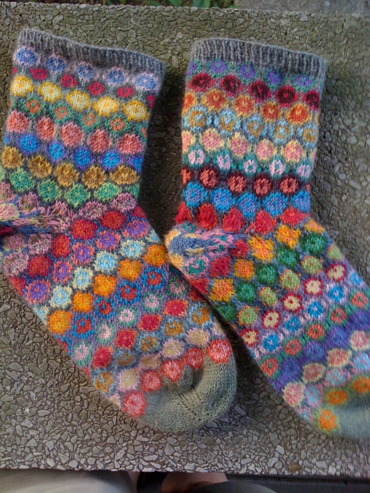
To be honest, sometimes I myself can’t figure out why. My most popular work on Ravelry is a pair of socks I made in 2009, which I made while I still thought that throwing the kitchen sink into the color mix was a viable design strategy. I don’t like the colors very much, but somehow I have persuaded a lot of people that this color jumble is beautiful.
This child’s jacket, from 2010, narrowly avoided color disaster. It has an unusual construction that begins at the armpit, so I started with the green that has some gray mixed into it and the maroon red, then moved on to the periwinkle and muted orange. The colors had looked interesting together in a good way when I grouped them together in their skeins, but then broke out into open rebellion against me and each other when I got to the periwinkle and muted orange combination. The bright turquoise was the rescuing element because it brightened the periwinkle and complemented the muted orange. The orange/red multi that I used for the edging completed the rescue, by reinforcing the muted orange, maroon, and purple in the stranded areas, and doing that thing that orange does by soothing other colors’ relationships with each other. Orange is magic.

After these many years of experience and experimentation with colors, I have developed some ability to predict how colors will interact in different environments, but it still is capable of surprising me. This sweater for my daughter, which I made a year ago, combines colors that almost clash, but I love them together although I have to dig deep to intellectualize why. The blues and greens relate directly to the blue and green variegation of the predominant yarn, and the reds are complements. And orange is magic. The colors repeat in stripes of varying widths, and also in the visible seams, which reinforces the purposefulness of this combination of bright and unusual colors.

Intentionality is an important idea in my current approach to knitting and design: everything needs to look as if it’s there on purpose. There has to be an underlying relatedness among the elements, even if that connection is very subtle. In fact, I get a particular kick out of connections that are so subtle that the viewer has to look long and hard to find it, and maybe can’t find it and ends up saying, “That shouldn’t work, but it does.” Revisiting my old work, I’m pleased and flattered that Lynda remembers it that way, because I was going on pure intuition and experimentation back then, and hadn’t yet learned how to pick and choose and arrange the flood of ideas that were suddenly pouring out of the spigot that Kaffe’s inspiration had opened.

Abby, amazing work! Regretfully I do not have 40 years to try and learn what you have already learned! I think I would like to call you the Gustav Klimt of the knitting world if I may…..
LikeLiked by 1 person
You may indeed give me all the unearned compliments you wish, with many thanks, Alison!
LikeLike
It seems to me that proportion, scale and repetition are big reasons your daughter’s sweater works.
LikeLiked by 1 person
I agree. Those are good ways to make weird colors work together.
LikeLike
Thank you for sharing! It’s so great to see where you started and to hear your thoughts on why certain things work or don’t work.
LikeLiked by 1 person
Thanks, I’m so glad you found my observations useful!
LikeLike
Abby, this is a great discussion of color use in design, one that I will revisit more than once. I love seeing your early works and reading your current thoughts on them. Thanks to your inspiration, I too look forward to presenting myself as a mad genius in another couple of decades. I particularly love this remark: “I no longer go looking for color trouble just to see if I can get myself out of it.” Take away the word “color”, and this applies to so much in life . . .
ps: I think the socks work because they’re a small canvas, because the figures are small and uniform, and because they’re grounded in that warm medium grey. I find them very pleasing.
LikeLiked by 1 person
Thanks for your comment, Gretchen! Also for your insight into why those socks are aesthetically pleasing. I can use all the insight I can get on those.
LikeLike
You are amazing Abbey, ,,
LikeLike
Oh my! Thank you, Barbara!
LikeLike
Great!!!! Love IT! Dident you sell some of your work????
LikeLike
Thanks, except that I can’t figure out which post that you’re commenting on! I don’t sell my work.
LikeLike