
While I was working on my master’s degree in Near Eastern Studies during my pre-knitting 20’s, I encountered an Israeli artist who attempted to explain to me the logic of her color use in one of her works. At that stage in my life, my focus was on learning the morphology of Arabic words so that I could find stuff in the dictionary and understand my homework assignments, rather than on noticing color relationships. She got miffed when I didn’t understand her and told me in frustration, “Clearly you have no talent for art.” I remembered that a few years later when my experimentation with Kaffe Fassett’s way of using color taught me different way to see. I got a really nice compliment on a recent blog post, asking me if my color use is talent or can it be learned. I have been thinking about color use as a decision-making process that can be taught… or is it talent that can’t be taught? Like that old make-up ad, “maybe she’s born with it… maybe it’s Maybelline.”
Over the years, I have discovered some number of devices for making colors look good together, and I employed them all in a project I just completed. I see it as a test bed for tactics that can be used by people who don’t think they have a particular talent for color to create color compositions that look connected and intentional, even when they have doubts about the colors. I’m still thinking about that dividing line between innate talent and replicable techniques that anyone can apply; there are some things that can’t be taught, but the dividing line between the things that can be taught and the things that can’t is pretty fuzzy.
Back at the beginning of the pandemic, I bought a ton of yarn, including the entire palette of West Yorkshire Spinners Re:treat line. I love this yarn because it makes the warmest, most comforting cold-weather gear ever. It has gotten Dr. Baby through three arctic winters in Minneapolis and shivery little me through this last winter in Baltimore, which is much warmer than Minneapolis, but my cold tolerance is not what it used to be. The only problem is that I don’t like the palette. I think there’s something wrong with the dye mix that curdles the colors. No one else seems to see it, but I can’t unsee it. I can’t quite identify what the problem is, something about inconsistent amounts of mutedness in the colors. Possibly there’s brown thrown into the mix of some of the colors and gray in others, but the colors look like near misses to me. But I am committed to this yarn because of the functionality of the garments, and all colors can be beautiful in the right circumstances, so my task was to use my cunning to fool everyone into thinking the colors were compatible.
My first inclination was to find the ways the colors were related, by arranging them in the closest possible color-wheel gradient. At first I thought about appropriating a Bohus pattern, because Bohus patterns are very good at blending colors together with purl bumps and gradient arrangements. It also drives Bohus purists around the bend when the classic Bohus patterns are used with yarns and colors that aren’t approved by the Bohus Powers That Be, and I’m evil enough to be attracted to the idea of yanking that chain. Ultimately I decided not to, because Re:treat tends to pill, which would muddy the effect of the Bohus bag of tricks, and also because I didn’t really like the Bohus pattern that much, and spite wasn’t a good enough reason to go to the trouble of appropriating the pattern.
Chevron stripes are one if my recurring motifs. The reason why I rejected the Bohus pattern was that it wasn’t as much of a chevron stripe as I remembered, but I knew that Barbara Walker had a number of chevron striped stitch patterns, and I found one that fit what I was envisioning and tried out my colors during this year’s January Swatchathon. I grouped my colors into three categories, dark colors, light colors, and black-white-gray. The black-white-gray was very important in the design, because it seemed to me that the dark colors and the light colors were in conflict with each other, and the sequence of light gray/white/black/dark gray separated the combatants and posed the composition as a conversation between the dark colors and black/white and a separate conversation between the light colors and black/white. Black and white are a powerful team. Together they give structure and organization to other colors. I didn’t really like my swatch, despite the gradients and the black-white-gray reset sequence, but I had more tactics to deploy.

One of those tactics was to repeat the black and white in a different form. Instead of knit-purl ribbings, which I don’t usually like very much, I knitted a black garter stitch edging with white dots formed by slipped stitch bumps. My design strategy is based on a balance of repetition and variety, and these edges repeated the stabilizing effect of the black and white zigzag stripes in a black and white dotted variant. Knitting upward from the black and white dotted hem, I worked through the dark jewel toned gradient (green, blue, purple, fuchsia, red), then the light gray-white-black-dark gray sequence, and then the light muted gradient (dusky pink, mustard yellow, tan, rust). That was the first iteration of the complete rota. I didn’t really like it. Despite the peace-making efforts of the black-white-gray buffer zone, the two color gradient sequences continued to snipe at each other. Next tactic: repeat the rota. The second time around establishes the fact that the first time wasn’t an accident. Clearly, it’s part of a plan, and the observer’s eye looks for and hopefully finds relationships between the components of the rota that give the eye interesting things to think about. I repeated the rota on the two sleeves, which showed I really, really meant it. And the strategy seemed to be working for everyone but me, so… two cheers! My daughter, in fact both daughters, liked it a lot, as did the brain trust on my Ravelry group and people on my The Interior of My Brain Facebook page. Melissa liked it. Everyone liked it except me.

When I got to the place in the rota where I joined the sleeves to the body, I was almost done with the dark jewel toned sequence. My plan was to complete two iterations of the rota, up into the yoke, before decreasing for the yoke shaping. I got my numbers from Elizabeth Zimmermann’s Elizabeth’s Percentage System, which doesn’t work for all body types, since Elizabeth developed it based on the proportions of her slender and gorgeous family, but my daughter’s proportions would fit right in with the Zimmermann family. My “key number,” the number of stitches around the chest, was a lucky 144, which is divisible by 3, 4, 6, 8, 9, 12, 16, 24, and many more numbers, which makes it easily and evenly divisible by one-quarter and one-third, and the remaining stitches after a one-quarter and one-third decrease are still divisible by one quarter and one third. Applying EPS, the sleeves at their largest circumference were one third of the key number 144, so 48 stitches. The stitches at the armpit were 8% of key number, which didn’t come out evenly, but 11.52 is close enough to 12, and subtracting the 48 stitches at the armpits (12 x 2 x2) and adding the remaining stitches together gave me another fortuitous number, 192, at the sleeve-to-body join. The 192 stitches lent themselves easily to three decrease rows of one quarter (knit 2, knit 2 together), one third (knit 1, knit 2 together), and a final one-third decrease row. 192 x 3/4 = 144, 144 x 2/3 = 96, 96 x 2/3 = 72 at the neck band.

While I was laboriously knitting the two repetitions of this color rota that I was incapable of loving, I had some additional tricks up my sleeve for unifying the colors and creating a coherent design, and these tricks were going to make their appearance in the upper yoke. These tricks were not merely aesthetic. They were also convenient vehicles for working yoke decreases and short rows in the back for shaping the neck. My quest to complete a second iteration of the rota had produced a very long yoke that didn’t have any decreases, so I was going to have to squeeze my decreases and neck-shaping short rows into a relatively short length of knitting. The decreases went into the three bands of black and white dots, which echoed the edgings at the hem and cuffs and cross-referenced the black-white-gray chevron stripes. This eye movement helps to bind the entire rota together, while the black and white graphic pattern subordinates the colors to its high contrast, which blunts the appearance of incompatibility among the colors.
I had one final trick that combined function with aesthetics. The chevron stripe pattern didn’t offer an easy opportunity for the neck-shaping short rows to cover the back of the neck and prevent the front of the neck from riding up and strangling the throat. Well, actually, now that I think about it, there is a plain row in the stitch pattern that might have permitted it. But I didn’t think of that when it might have been relevant, and I would have rejected that option anyway because it would have perpetuated the problem I was having with the colors instead of helping to resolve it. My solution was stranded knitting, my comfort zone, in a one-by-one alternation of colors in a vertical stripe, into which I could easily knit extra rows through German short rows. My trick was something I had learned way back in my Kaffe Fassett-inspired color experiments, when I would throw in a color that curdled the whole composition and needed to salvage it. I discovered that if I repeated the offending color at least once in a different color environment, it would be incorporated into the design and thus be rehabilitated. So my final tactic was to reuse some of the bickering colors in alternation with a peace-making color, a gray-green-blue that seemed to look good with just about the entire Re:treat palette. That color hadn’t made its way into the rota because it had fallen out of the bag when I established the rota, and I forgot about it. I decided that was just as well, because it made visual sense to me to use a new color in a place where I was trying to reconcile previously-used conflicting colors and recast them in a new environment.

The fact that the yoke was getting ridiculously long, after completing the second iteration of the rota, meant that I needed to wrap this thing up as quickly as possible. If I had had lots of space that needed to be covered, I could have done what I originally wanted to do, which was to use each of the colors in the rota in alternation with the gray-green-blue for five rows each. That would have given me a 2-foot-long yoke. Maybe a 3-foot-long yoke. But when I finished the rota and was about to begin the yoke decreases, the yoke was already six and a half inches deep, and I didn’t want it to be a lot more than 10 inches deep on the front side. That meant I needed to fit in three black-and-white dotted decrease sequences, each an inch deep, and two stranded sequences. The height and number of the decrease sequences couldn’t be reduced, so it was the stranded sequences that were going to have to be scaled back. But they needed to be there for reasons of fit and aesthetics, and I judged that the minimum number of color pairings that would accomplish that was two in each of the spaces between the black and white dots. I wanted these sequences to move the eye to the part of the rota where the colors were originally used for a cross-reference that would unify the design in the brain of the viewer, so each of these sequences has a color from the dark part of the rota and a color from the light part. The one-by-one alternation with the gray-green-blue is a very different environment from the color’s environment in the chevron stripe, but that’s the point: a color will be more incorporated into the design as a whole when it recurs in a different environment.
The first stranded section has three rows each for the two rota colors at the front. The neck-shaping short rows are on the back, aligned at the center of the shoulders, with two extra rows per color. German short rows hide the turn where the extra rows were knitted.

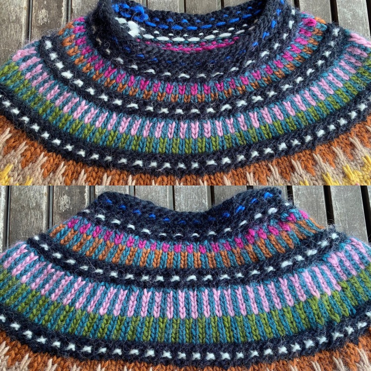
I knitted a plain row of gray-green-blue before the black garter stitch rows so that the garter stitch wouldn’t encroach on the stranded part. The second stranded section has two rows per rota color in the front and one set of short rows at the back, since six short rows were enough to shape the neck and this thing really had to end sometime. I played with the colors, as is my wont. The first color pairing was low contrast, between green and gray-green-blue, and the second was high contrast, with the light pink. In the second stranded sequence, I went for a gradient in the rota colors, using the rust to represent the light color grouping and fuchsia from the dark color grouping. In fact there’s little value difference between the two, and in fact there isn’t a lot of value difference between the two of them and the gray-green-blue, so the stranding makes the combination look a bit muddy, but the fuchsia kind of glows. I like that, because elsewhere the fuchsia looks obtrusive, to my eye, and the reuse of the color reduces that effect. By the time I got to the final decrease row, the yoke was 11 inches deep. Once I had my final stitch count, I knitted another band of garter stitch and purl bumps, this time using the blue rather than the white for the purl bumps. It doesn’t show very clearly, but I wanted to use the blue in a different environment. It’s subtle, but I see an effect.
The composition was complete, so I put it onto a hanger and hung it outside where I could see its entirety from different distances.
Throughout the knitting process I had liked the colors from a distance or in bad light, because distance and bad light made them blend together, but my job was to make them work in all lights and from any distance. Now that I could view the finished result, I could see the problem, but I could also see the solution, and all my tricks seem to have done the trick. I really loved the way the light color grouping looked up at the yoke next to the black and white graphics and the muted color blending in the stranded vertical stripes. I had identified the dark red, the fuchsia, and the cobalt blue as the outliers in the palette, but the completed composition pulled them into the group, thanks to repetition and the gradient, rough as it was. The visual interaction between the light gradient and the dark gradient, which seemed like conflict while I was knitting it, had turned into a design element in the finished composition because they balanced each other. That balance brought peace to the warring parties. I like the look of the rota better from a distance than close up, but I guess that’s my own personal problem.
The finished garment is enormous, relative to the size of its intended recipient, my younger daughter. It fits me with room to spare, circumference-wise, and it’s long enough for me to wear it as a dress, or as a tunic over leggings if I choose to be more modest. My daughter is almost a half-foot taller than I am, and almost that much smaller around than I am, so it won’t be quite as dress-like on her but her slender little body will be engulfed, which isn’t necessarily a bad thing. Slim young women look quite adorable swimming in vast cozy sweaters, I think. No question, there will be swimming. It will be a couple of months before I see her and can force her to model in the heat of June, so we’ll have to settle for a modeled picture of me.
I will summarize the strategies I applied to impose order, if not beauty, on a set of colors that have never quite looked to me to be right together, knowing that order is its own beauty and will cause the viewer to accept the colors as a given and will prompt the eye to find its own logic to connect the colors. In fact, anomalous colors can make that quest more interesting. These are strategies that can be taught.
- Gradients. Group the colors together and find a progression, either by color-wheel hue or by light-dark value.
- Repetition. Establish a rota and repeat it.
- Black and white. The high contrast of black and white in a graphic pattern of dots, stripes, chevrons, checkerboards or other geometric repetitive patterning is like a reset button for colors. It orients them relative to that high contrast and distracts the eye from incompatibility and anomaly among the colors.
- Repeat the black and white motif at various points in the composition.
- Reuse anomalous colors in a different color environment.
- Size matters. Small patterns will blend the colors together from the distance in a kind of an average. Whether that’s desirable or not is a design decision. (I copy-pasted that from my April 2017 post “A Matter of Scale.” It’s still true.)
These are strategies for color use that can be taught. What can’t be taught are the aspects of color use that are personal, like memory, psychological associations, and individual preferences. I can teach the mechanics of building a gradient, establishing a rota, and setting off colors against black and white. I can teach people that colors change depending on their environment, and I can give them exercises that illustrate the point. I can encourage curiosity and experimentation, but I can’t teach it. I can encourage intrepidness, a willingness to fail, and resourcefulness to rescue a fail, and I can suggest ways to turn a mistake into a design feature, usually through repetition and strategic variation, but I can’t teach that. A person has to discover that for themselves. The good news is that experience is a learner’s friend. Theory can be paralyzing, but with experience, you build a body of knowledge after assessing the way colors behave in different environments that will enable you to anticipate with some degree of accuracy how they will behave in a new design. But always prepare to be surprised.
“Always prepare to be surprised” would be a good line to end on, but… I still have a nagging question. Why don’t I like the Re:treat palette, especially the jewel tones? Are they always off, is the dye mix permanently wrong? I decided to make a swatch in 2-color brioche ribbing, which creates a reversible fabric in which one color dominates and the other color provides shading, and it’s the opposite on the other side. I wanted to see what would happen if I paired fuchsia and rust, as I did in the stranded yoke segment just before the end of the sweater, and put it next to the gray-green-blue that I liked as a bridge color for the palette, pairing it with the green. Then I wanted to see how it would look with the other jewel-tone colors, and I couldn’t stop swatching, so someone is going to get a nice snuggly scarf. The colors look so different in this environment, sort of like the iridescent colors of an oily puddle, and I’m finding these unloved colors now to be beautiful.


What a fascinating experiment. I’m intrigued by your list of strategies and keen to give them a try. Thanks for taking the time to write about your work.
LikeLiked by 1 person
Please let me know what results you get!
LikeLiked by 1 person
Well, you look divine. I love the black and white dots so much!
LikeLiked by 1 person
Thank you so much!
LikeLiked by 1 person
Great analysis, Abby. And, of course, you already know that I love the sweater.
LikeLike
Thanks, Gretchen!
LikeLike
This is fascinating research.
I admit, I find this palette unpalatable too. I think it’s because the yellow and cyan they were mixed from are warm rather than neutral. You can see it in the purple and pink, they’re dusty. The greens are yellowed and earthy. So the magenta is much clearer than really anything else, because it’s getting dulled when it’s mixed. But there might be more than 3 primaries used, because I would expect the orange to be fantastic, but it’s saddened.
What I’m saying is totally from the peanut gallery, because I am not familiar with this yarn and all the colors available.
Yarn palettes that thrill me tend to be mixed from CMY bases that are all as nearly neutral as possible. Then all 3 secondaries are balanced, and you can sadden everything without shifting things toward brown, green, etc, unless that’s what you want.
Creating a really satisfying 3-primary watercolor palette is what helped me understand this. The colors on the inside flap of a cereal box (or other color separation process printed item) are a good starting place. When you find a great triad, you really can mix a true black. And virtually anything else.
Two yarn companies whose colors thrill me this way are Classic Elite (now closed) and Red Fish Dye Works.
LikeLiked by 1 person
You see it too! That’s really an interesting explanation for why this palette looks so wrong to me. Thanks for the terminology, I can see the impurity in the dye mix but didn’t have the vocabulary to pin down where it went wrong.
LikeLike
Well, it’s just a guess, not based on adequate info to be really sure. You’d have to ask the yarn manufacturer to be sure.
I wouldn’t call it an impurity though, since I’m sure the dyes are top quality. Just a choice the dyer is making, which suits their vision for this palette. But it doesn’t match your vision. Perhaps you could offer to help them design some more colors for their line? That’s what several designers have opted to do for Rowan, rather than trying to find a different yarn line. Your blog reaches a lot of knitters, so I’m sure your involvement would drive some sales!
Alternatively, you could see if they will sell you some of the base yarn to dye yourself?
LikeLike
Impurity was the wrong word if it implied that the dyes were defective. I mean something in the mix is dirtying the colors, visually. I don’t think I have the skills to instruct the manufacturer in how to correct their colors. But perhaps I could communicate with them, as a devoted if frustrated user of their product, that the mixture of the dyes is producing incongruities in the palette. You have provided me with terminology that I lack, since I am not a trained artist, so thank you for this conversation.
LikeLike
I can see how the palette doesn’t agree with you. I’m not liking it either. [lolz] But the sweater looks quite striking on you! I can see this with a wide black or white belt or tie at the waist and matching leggings. I can’t wait to see it on the intended recipient.
LikeLike
Thank you! How I fought the palette to save it from itself. I’m glad you think I succeeded. The sweater is going to look a lot better on my young, tall, slender daughter than it does on her little teapot of a mother!
LikeLike
Love this tunic, Abby.
I also love your writing!
LikeLiked by 1 person
Thank you, Pat!
LikeLike